Boston Calling
Personal · Product Design · Mobile App
Concept · Research · Design · Prototype
Figma · Illustrator · Photoshop · Premiere
RESULTS
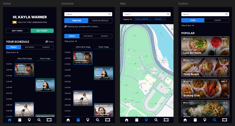
Researched competitors, gathered feedback, created a new visual system, developed a mobile app prototype.
GOALS
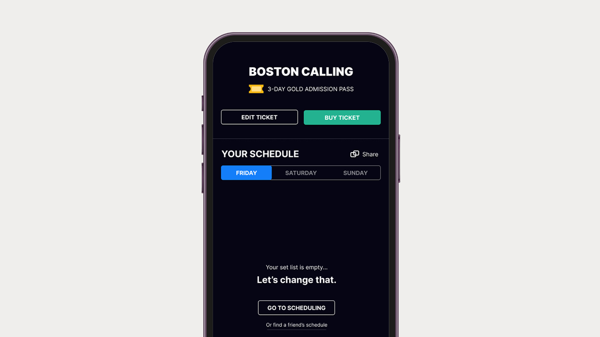
Boston Calling is an annual music festival within the Boston region. When I was looking to attend, I decided to redesign their app to make it easier to find attending artists and vendors.


A Quick Dive
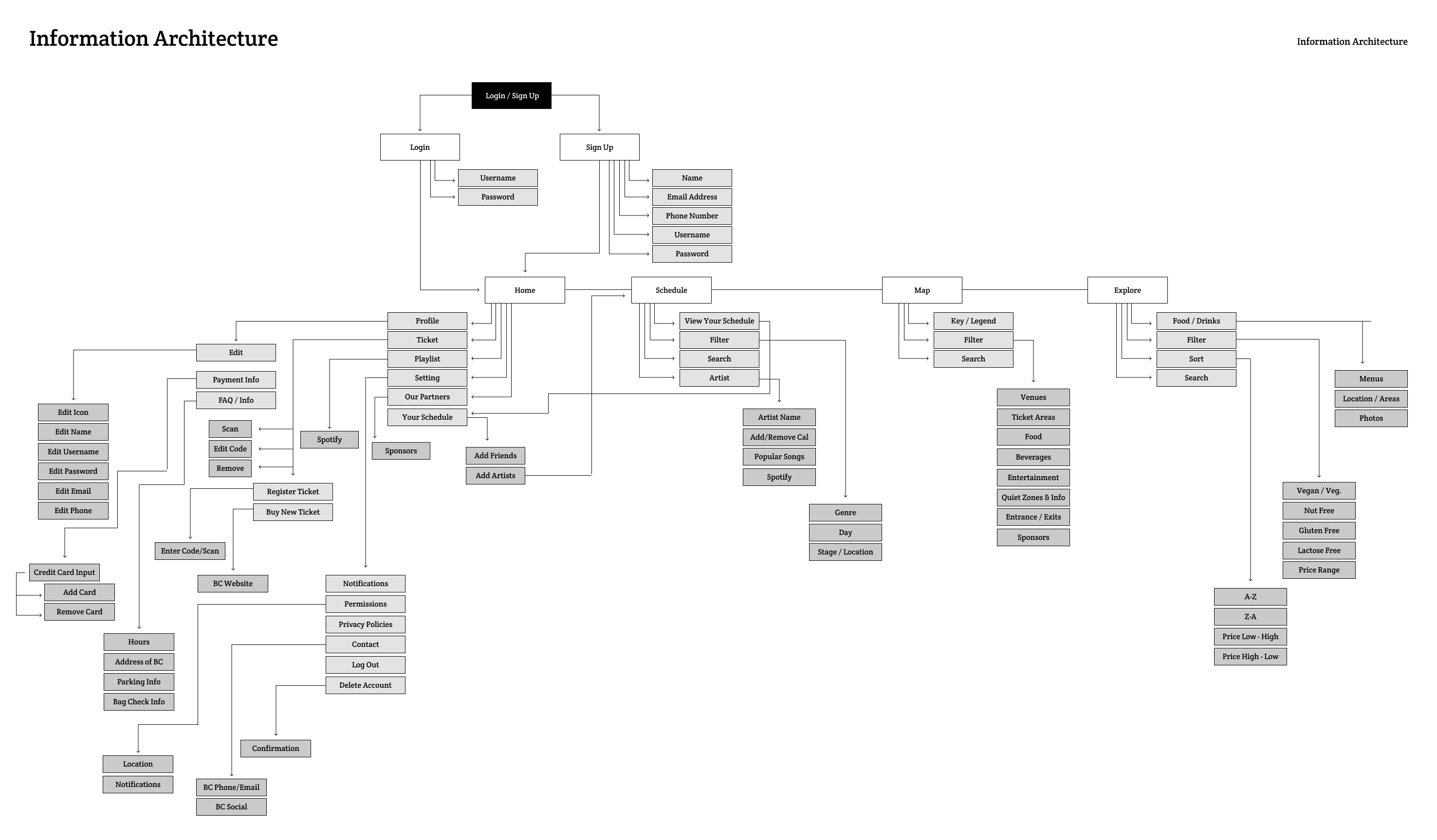
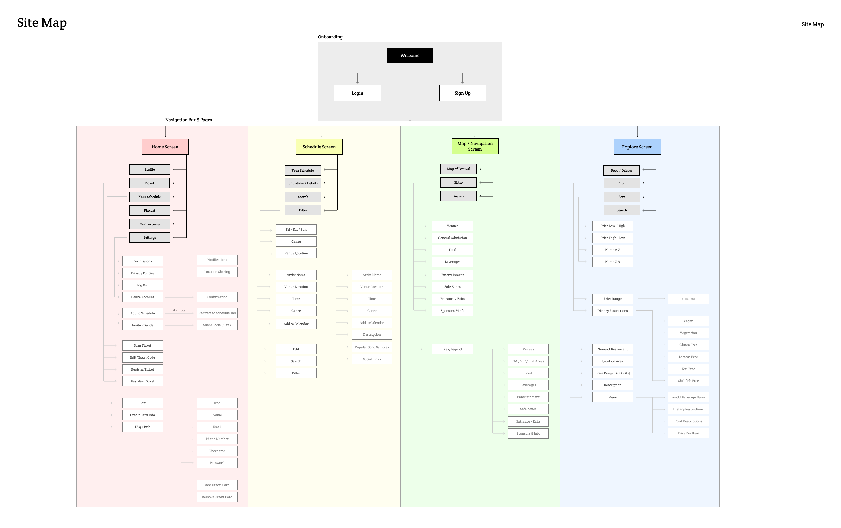
Research · Info Arch & Site Map · Wireframes & Fidelities · Design · Prototype
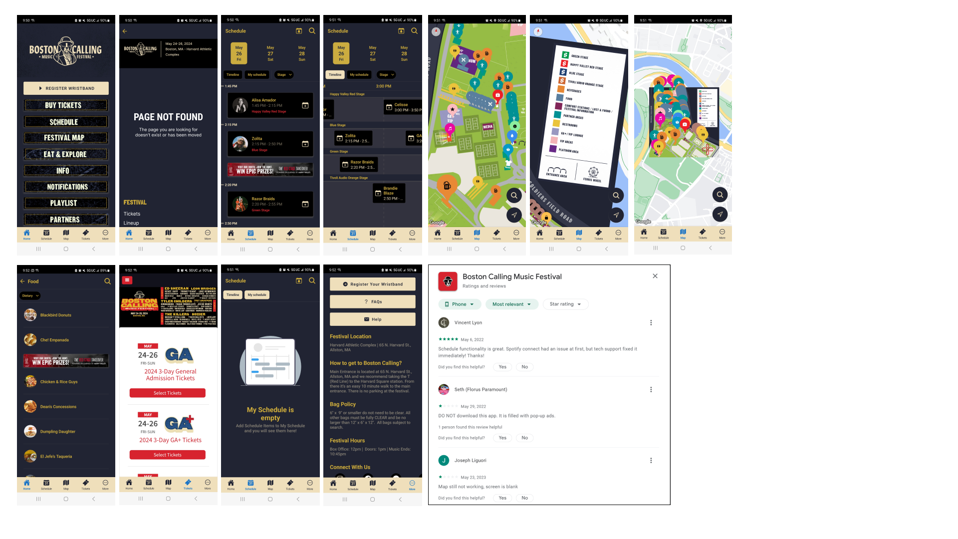
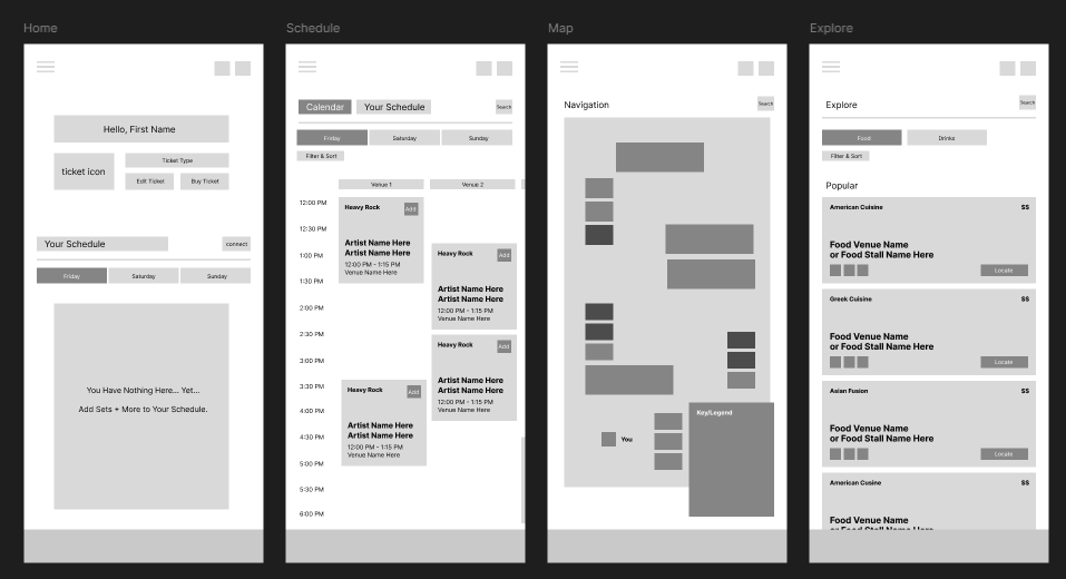
UGH, SERIOUSLY?
- The home page starts off slamming you with different buttons on the home page that becomes overwhelming and repetitive.
- When finding artists you had to scroll horizontally to view them (which felt awkward). Many users had feedback on ads being implemented within the schedule timeline and how jarring it felt.
- The map is a screenshot placed onto a google maps location, so when moving the map around, the legend is stuck in one place. This forces you to scroll back and forth between the map and key.
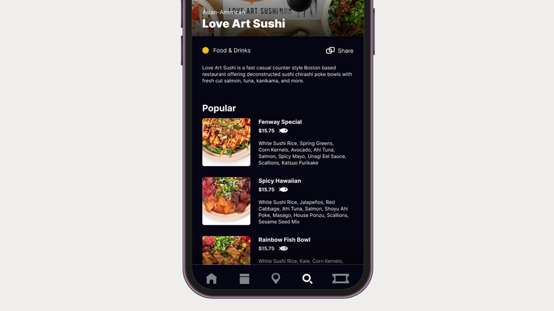
- The food vendors would display their name, and have a sentence about the style of food they serve. But there was no menu shown or dietary information for any of the food vendors available.
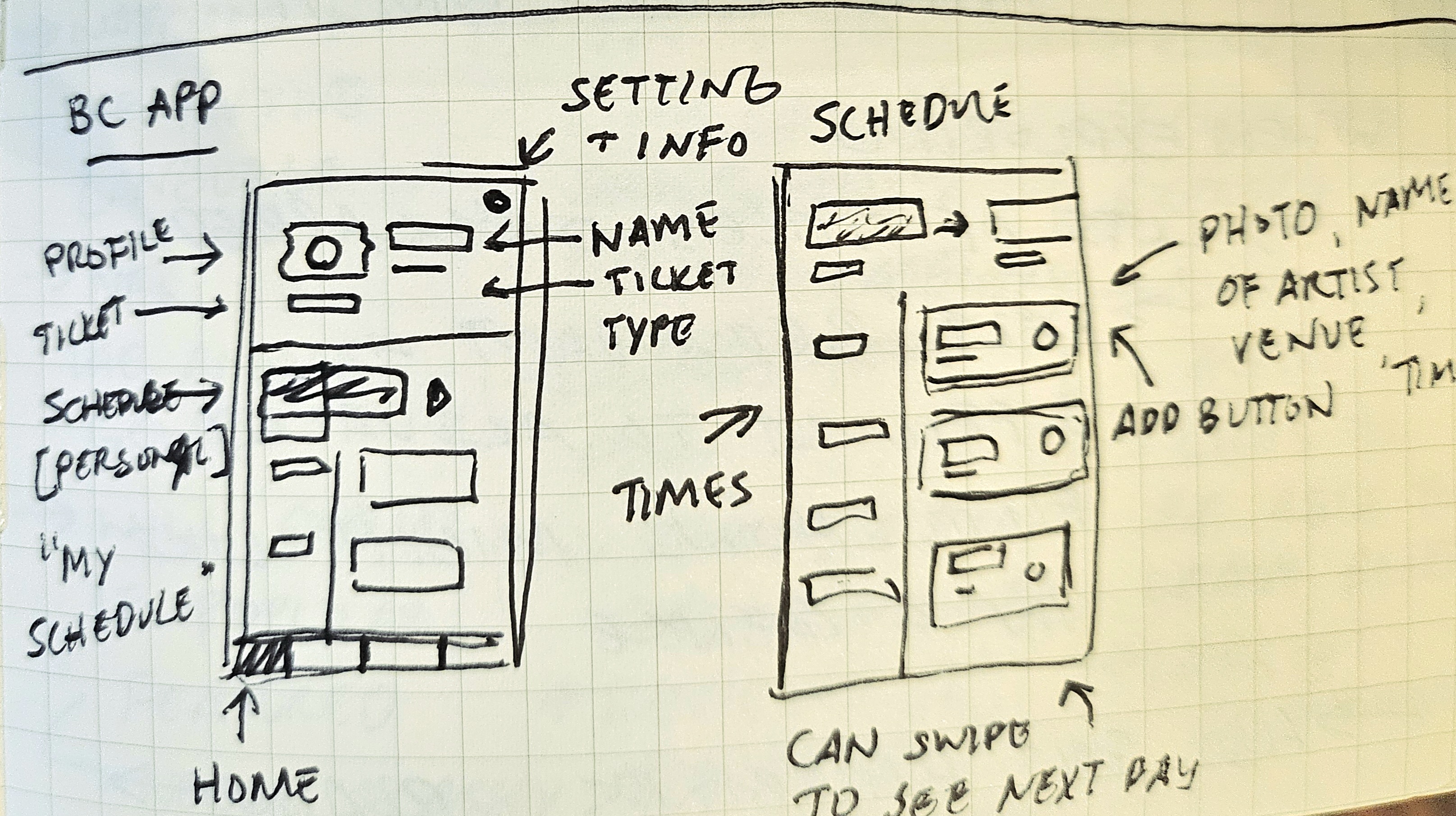
MAKING DECISIONS
- Most of the design choices I developed were deprived of my research from competitors: how they organized information, pathways, implemented features, and how each interaction felt.
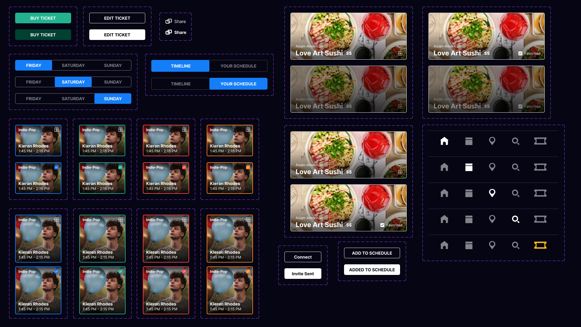
- When thinking about the audience, I looked at different pain points of boston calling's current app and developed features to make things more stream-lined: buying tickets in-app, sharing your schedule, favoriting artists, sampling different songs, creating a personalized schedule, menus for each food vendor, and allergy icons for food items.
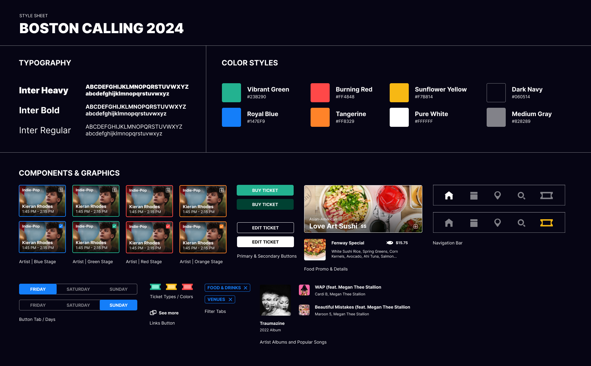
- Because every artist has their own unique style, I wanted to push towards a modern yet clean visual system (so it wouldn't clash with anyone!) while maintaining functionality.