Dishonored
Personal · Product Design · Video Game HUD
Concept · Research · Design · Prototype
Figma · Illustrator · Photoshop · Premiere
RESULTS
Researched different perspectives of inexperienced and experienced players to redesign an accessible HUD for the video game Dishonored.
GOALS
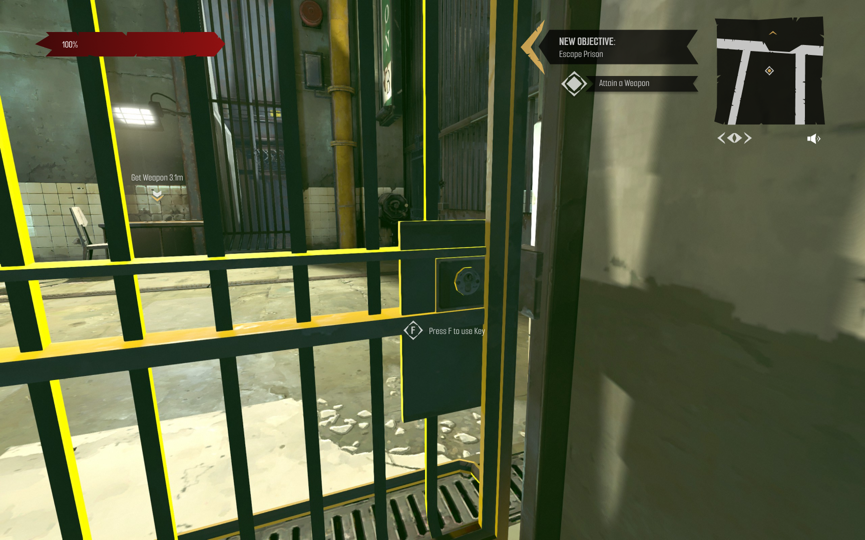
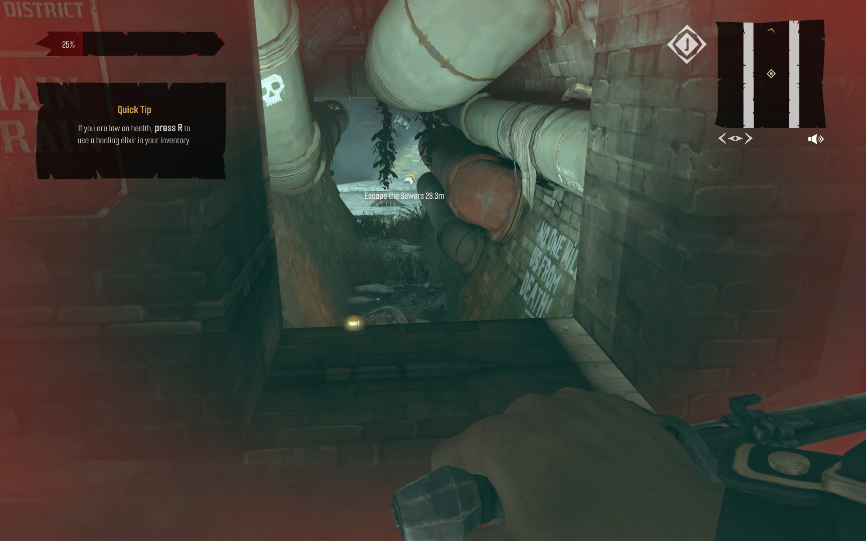
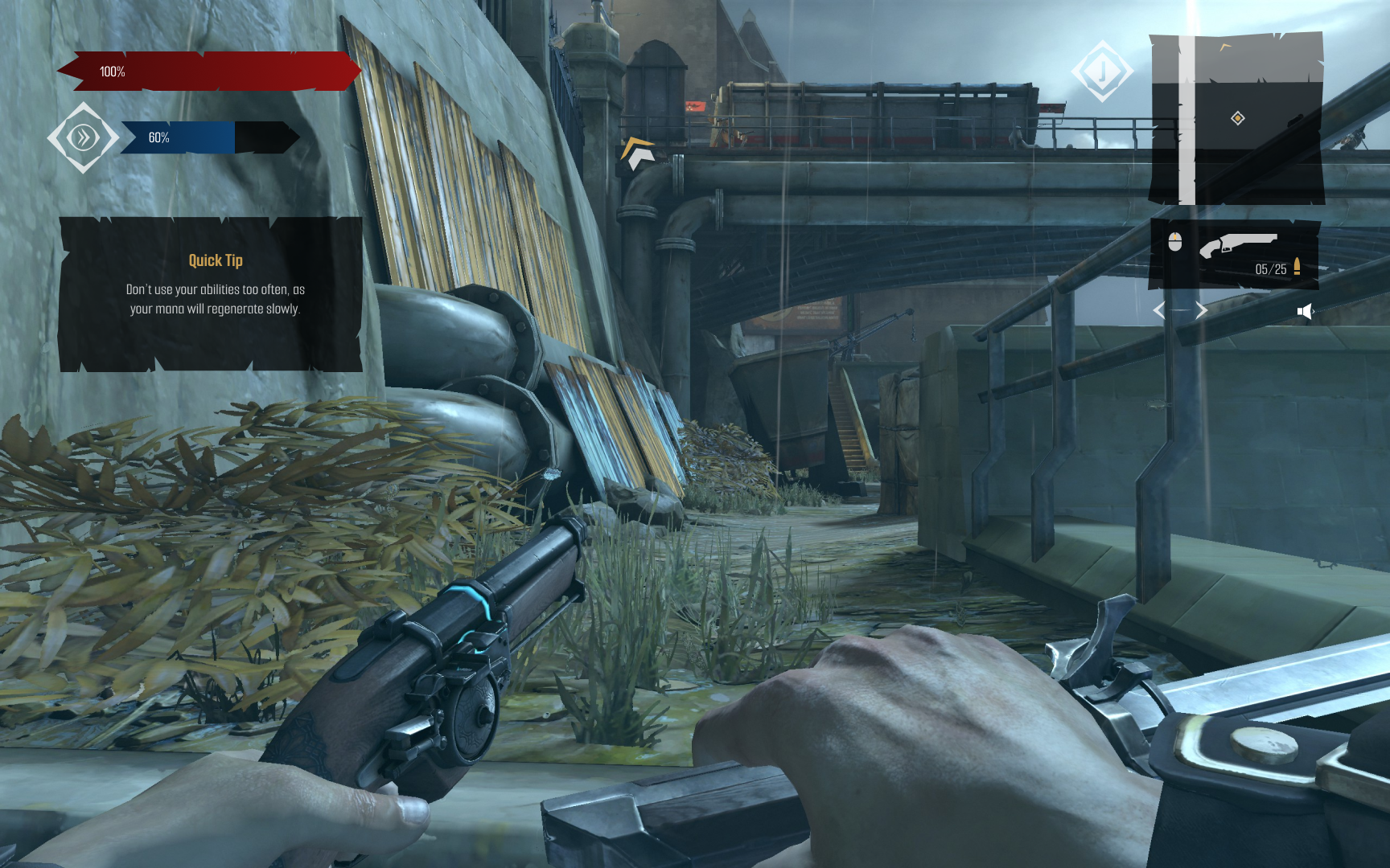
Video games often assume players know basic gaming knowledge and will omit information due to this. To make video games more accessible, I redesigned Dishonored’s HUD to help inexperienced players get into the space.
A Quick Dive
Research · Info Arch & Site Map · Wireframes & Fidelities · Design · Prototype
RESEARCH & GUINEA PIGS
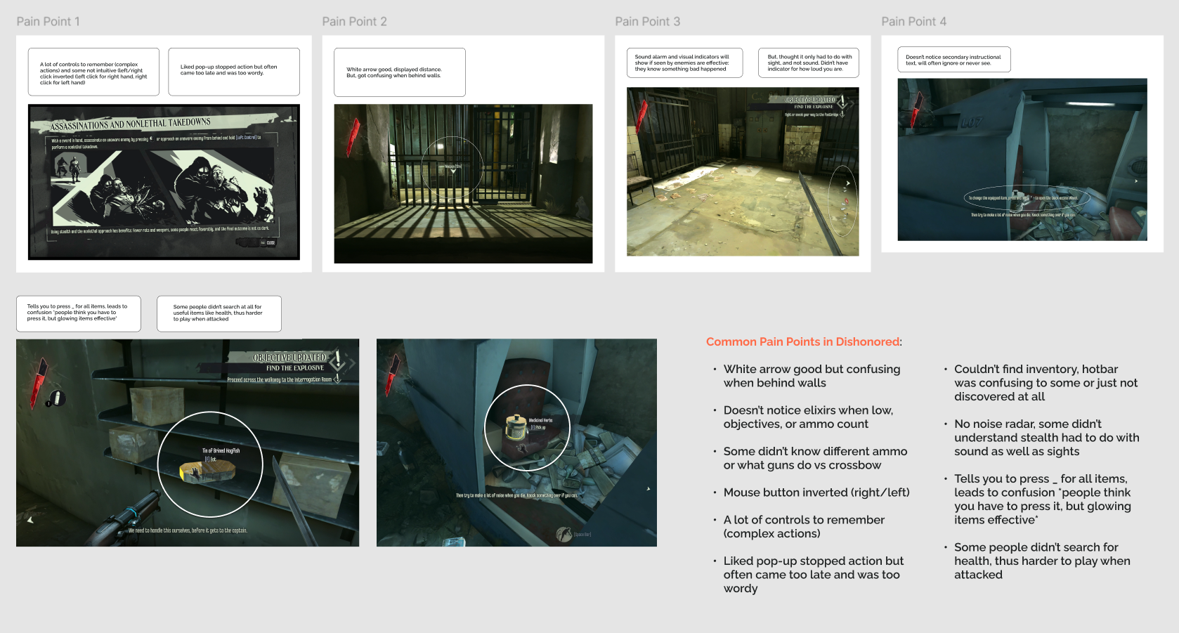
The process for research came in 3 different phases: survey, informal experiments, and interview. For the informal experiments, I had participants (both experienced and inexperienced players) play titles that they hadn’t played before and see what they excel or struggle in for the first hour.
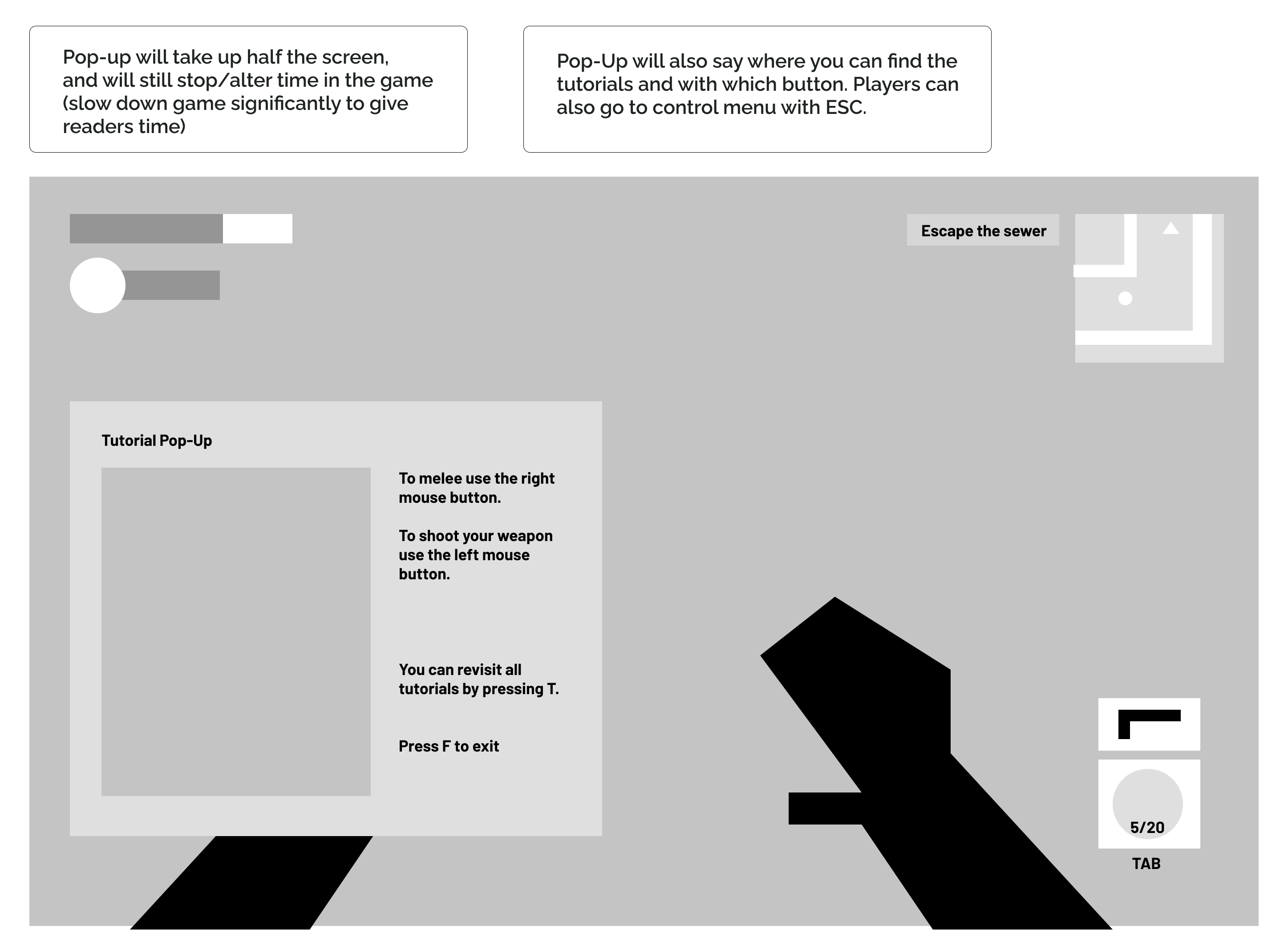
- I found that experienced players were moving fluently from the start. They were confident running, jumping, looking around, and attacking enemies. Their main frustration would be when tutorials would interrupt (and literally stop time) whatever they were doing.
- For inexperienced players things were more complicated in their eyes. In the title, Bioshock Infinite, it assumes that people know how to move around and didn’t have instructions because of it. This led to a lot of people getting stuck within the first 5 minutes of the game. In addition, they struggled with understanding their surroundings more than the experienced group because they were intensely focused on the center of their screen (and didn’t look around much). These restrictions ended up causing the inexperienced group to miss key information, like how to heal, quest items, enemy locations, and more.
FUNCTIONS, FEATURES, AND FUN
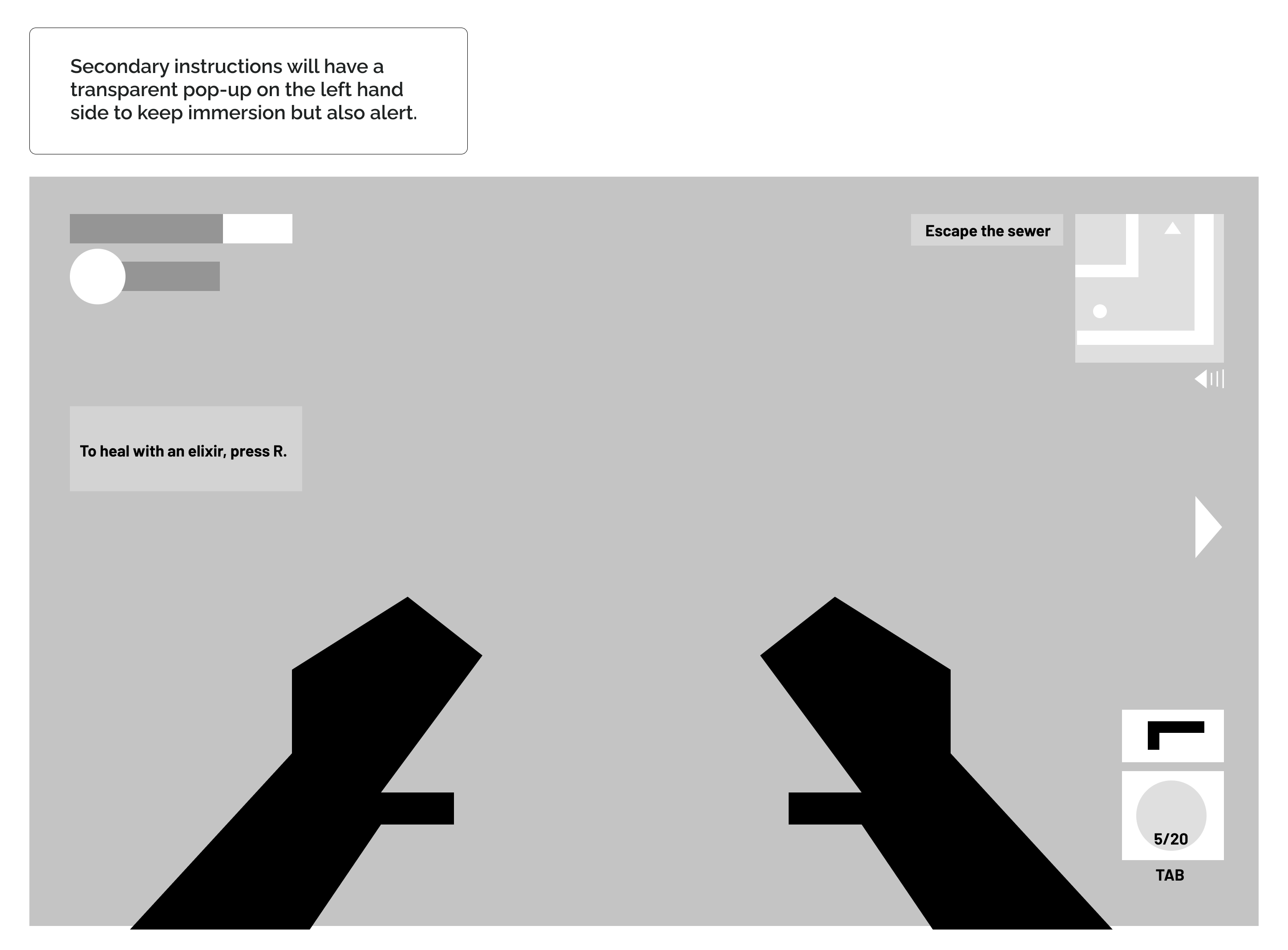
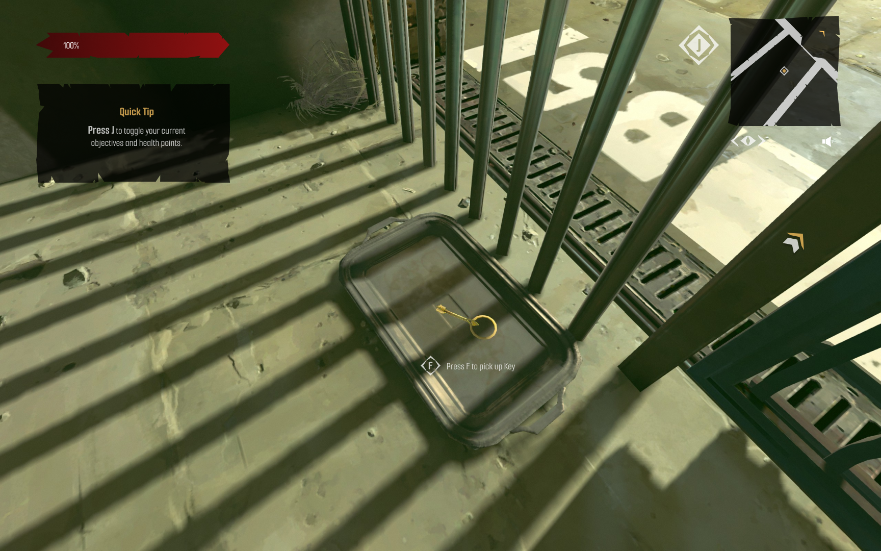
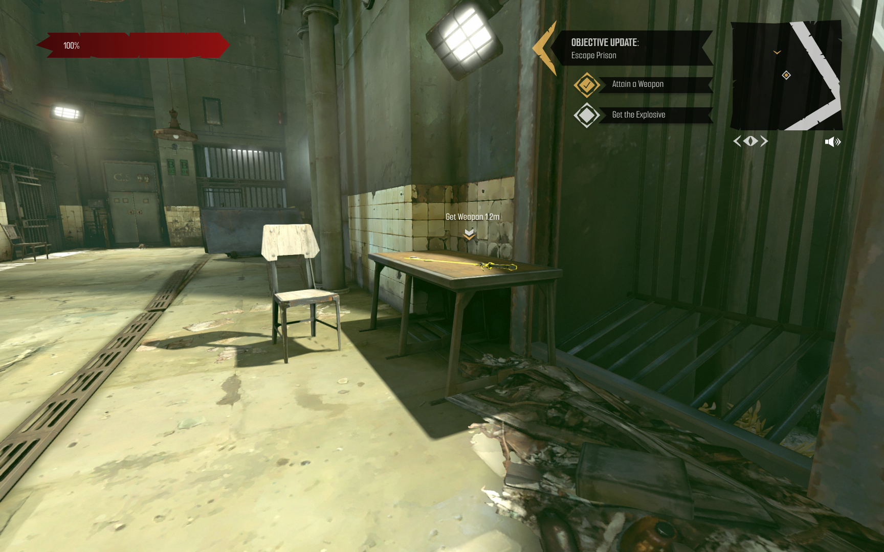
- When taking into account both groups it was clear that instructions were necessary, but there needed to be a middle ground as to how much it disrupts their gameplay. Due to this, I added a notification that wouldn’t stop gameplay, but would remain on the side until the player cleared it away manually.
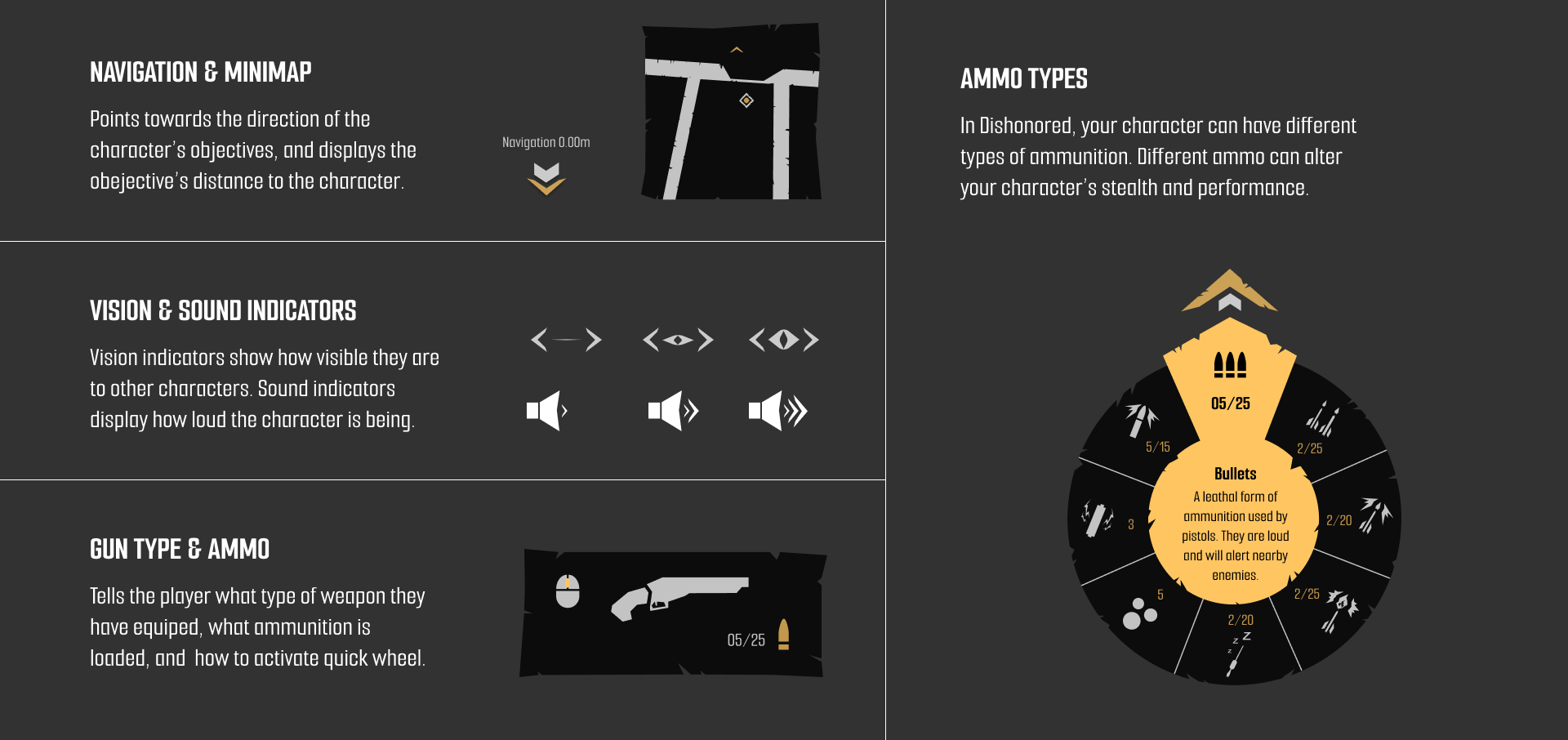
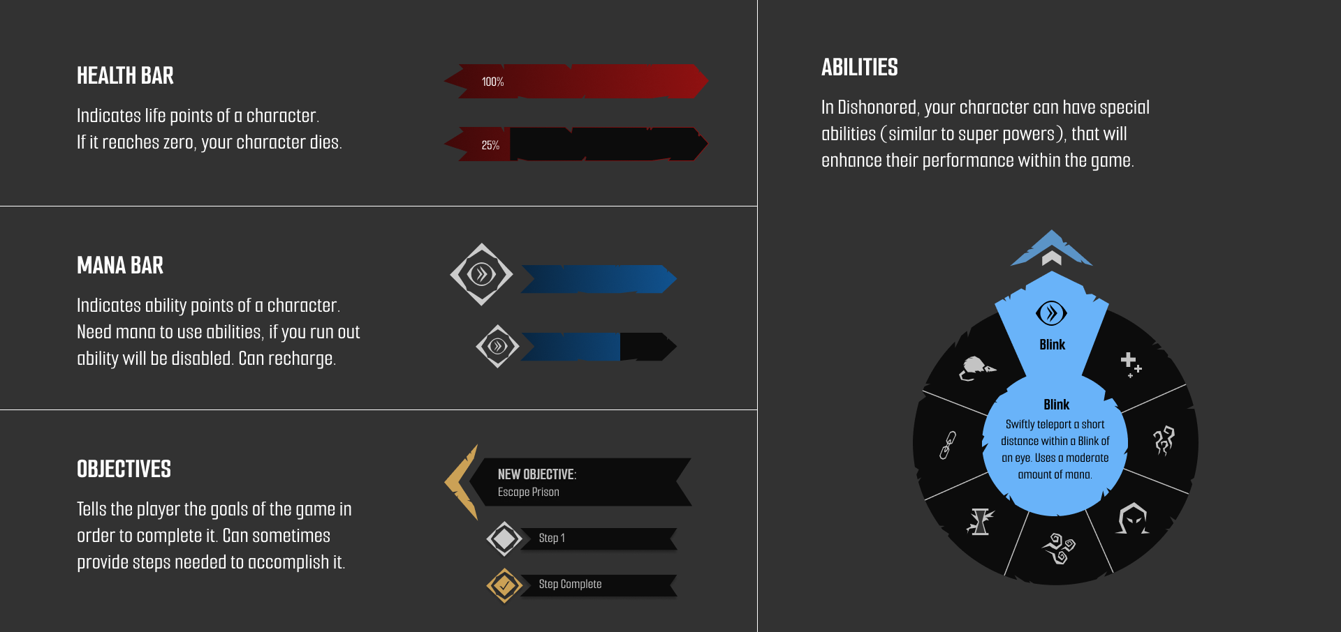
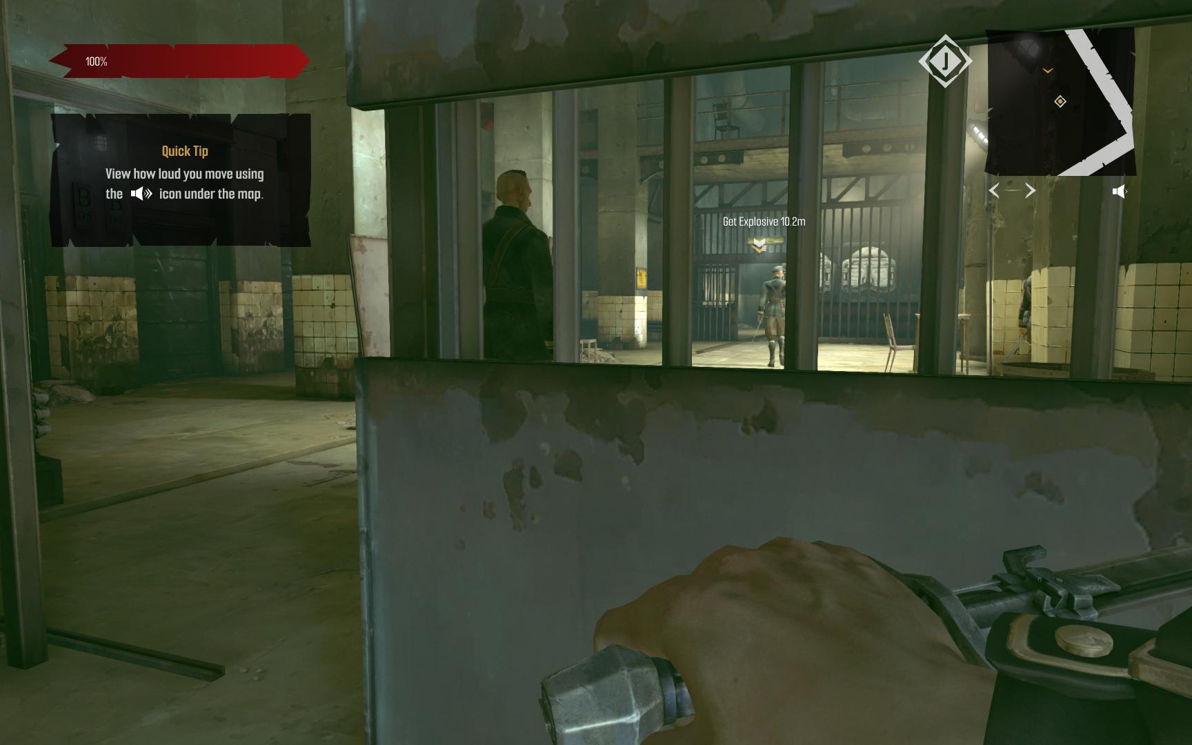
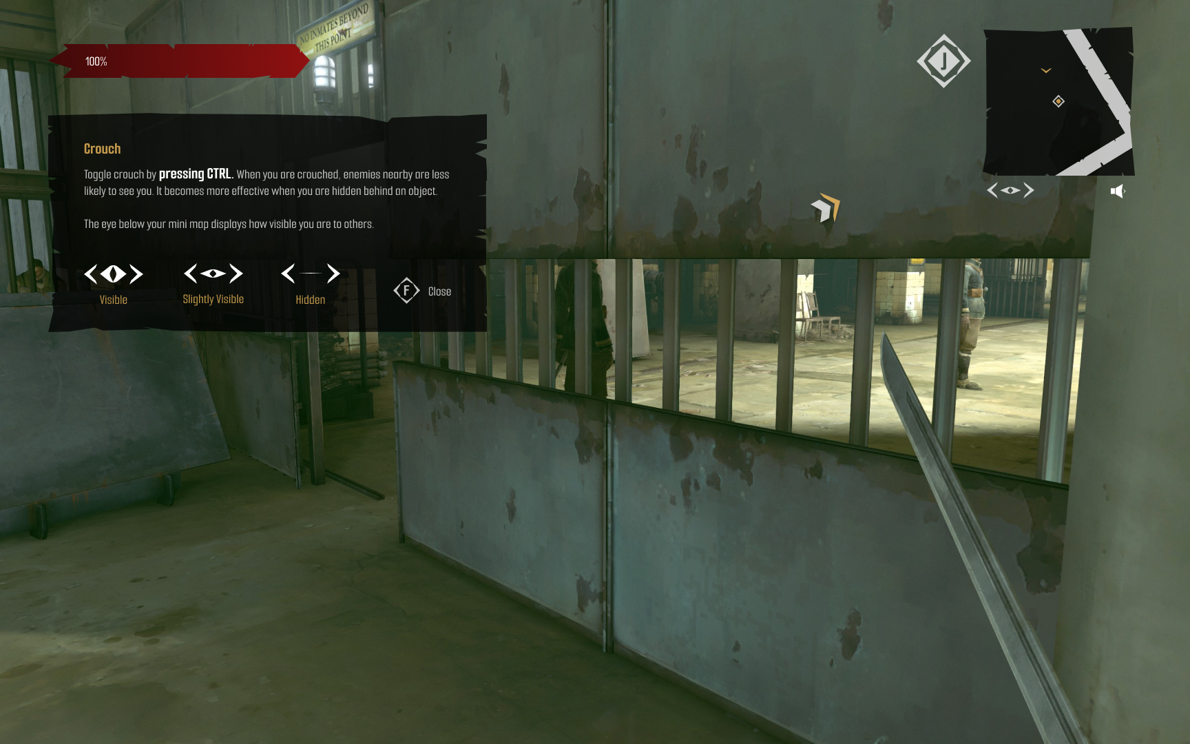
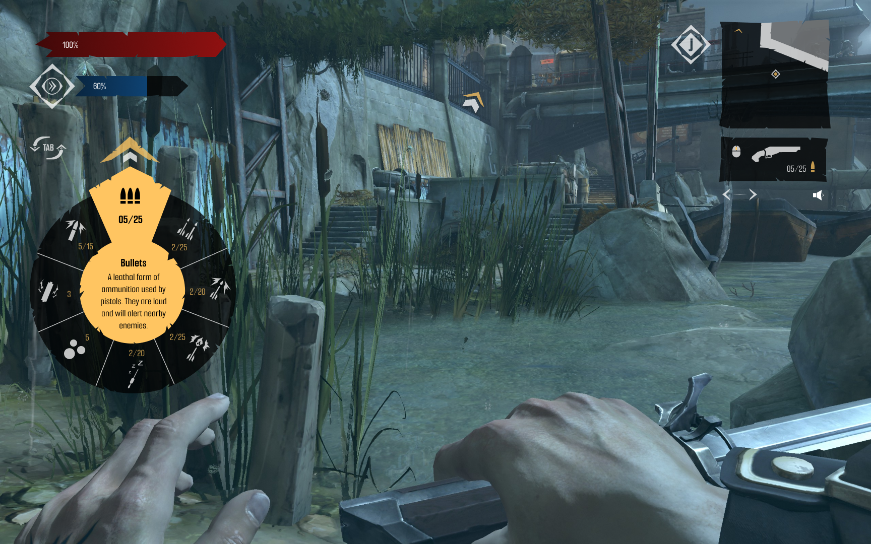
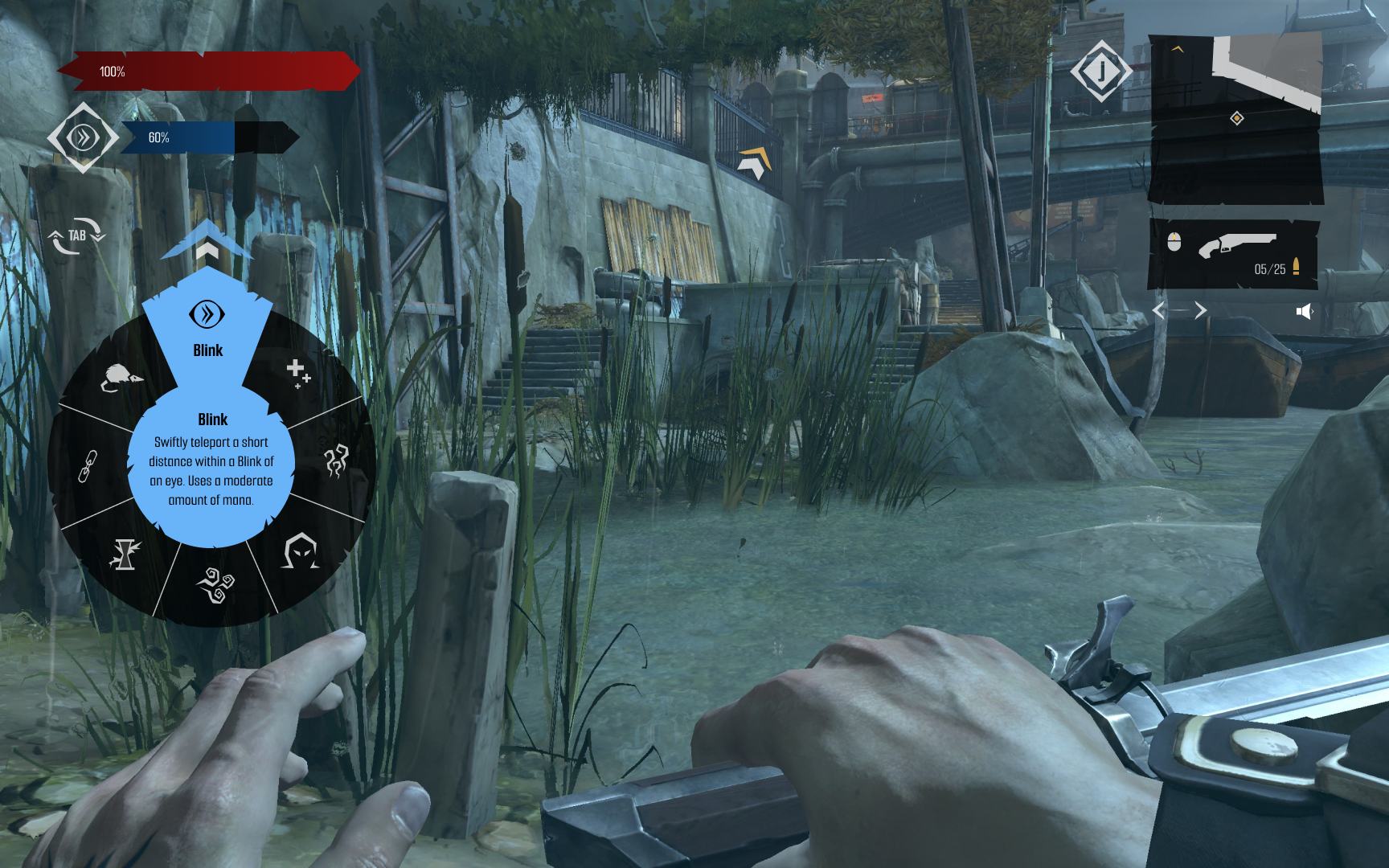
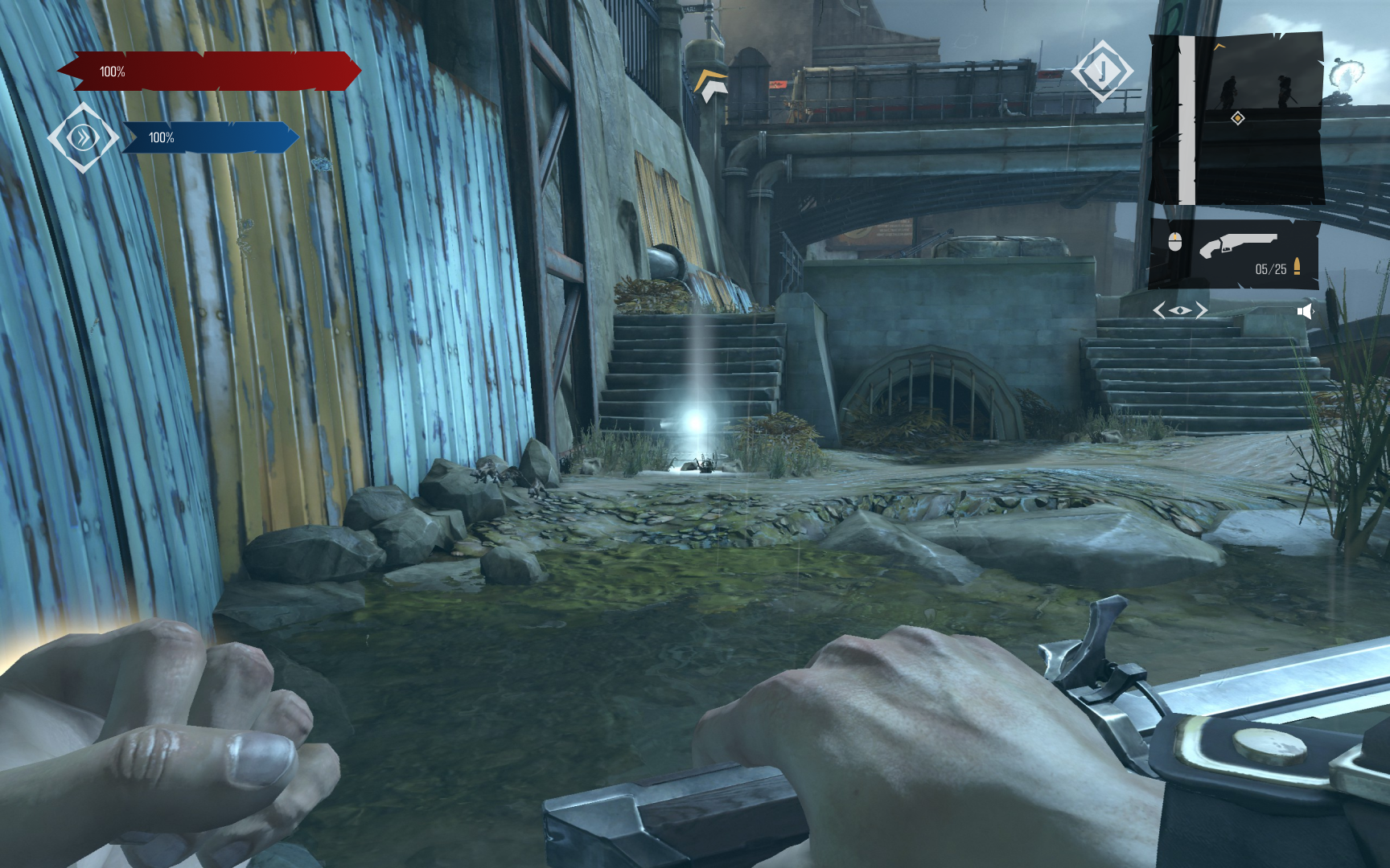
- To maintain immersion I ended up trying to visually match the HUD with the look and feel of the game Dishonored. The overall vibe is grungy, dystopian, and grey with minimal splashes of color. Reflected with rough edges and minimal accent colors, my visual system was created in hopes players don’t get distracted when playing.
- Dishonored is a game that is based on stealth. To make the game easier (and more interesting) I added visual and auditorial indicators to let players know how loud they are or if enemies can see you. In addition, I implemented a navigation arrow that is linked to a mini-map due to the amount of inexperienced players getting lost (and getting caught up in fights because of it).