Gaming for Non-Gamers
Personal · Product Design · Website
Concept · Research · Design · Prototype · Development
Figma · Illustrator · Photoshop · Premiere · HTML · CSS · Replit
RESULTS
Designed and developed a multi-page website to catalog research information and process.
GOALS
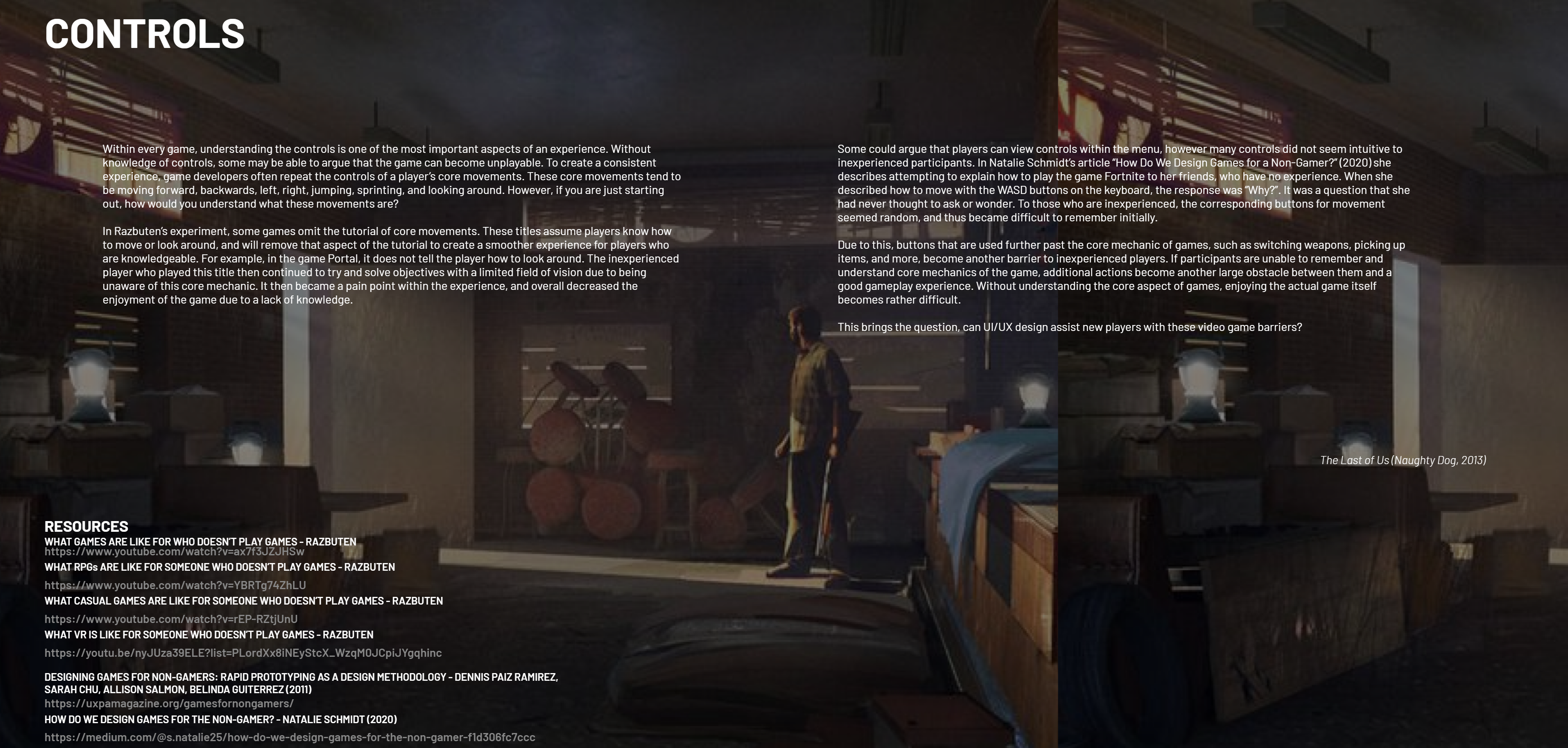
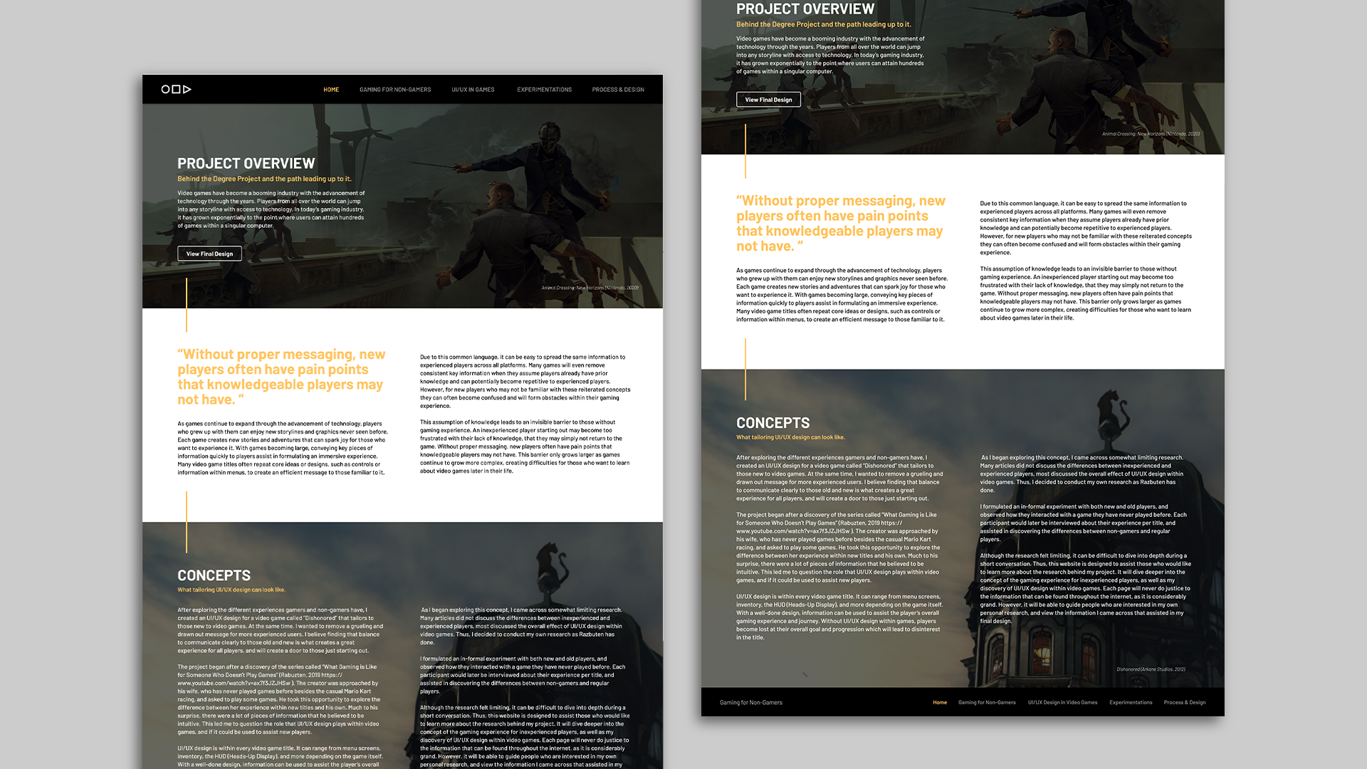
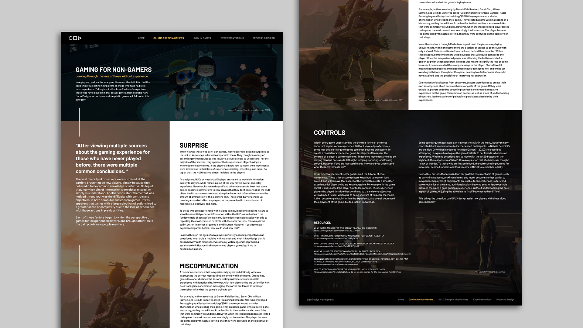
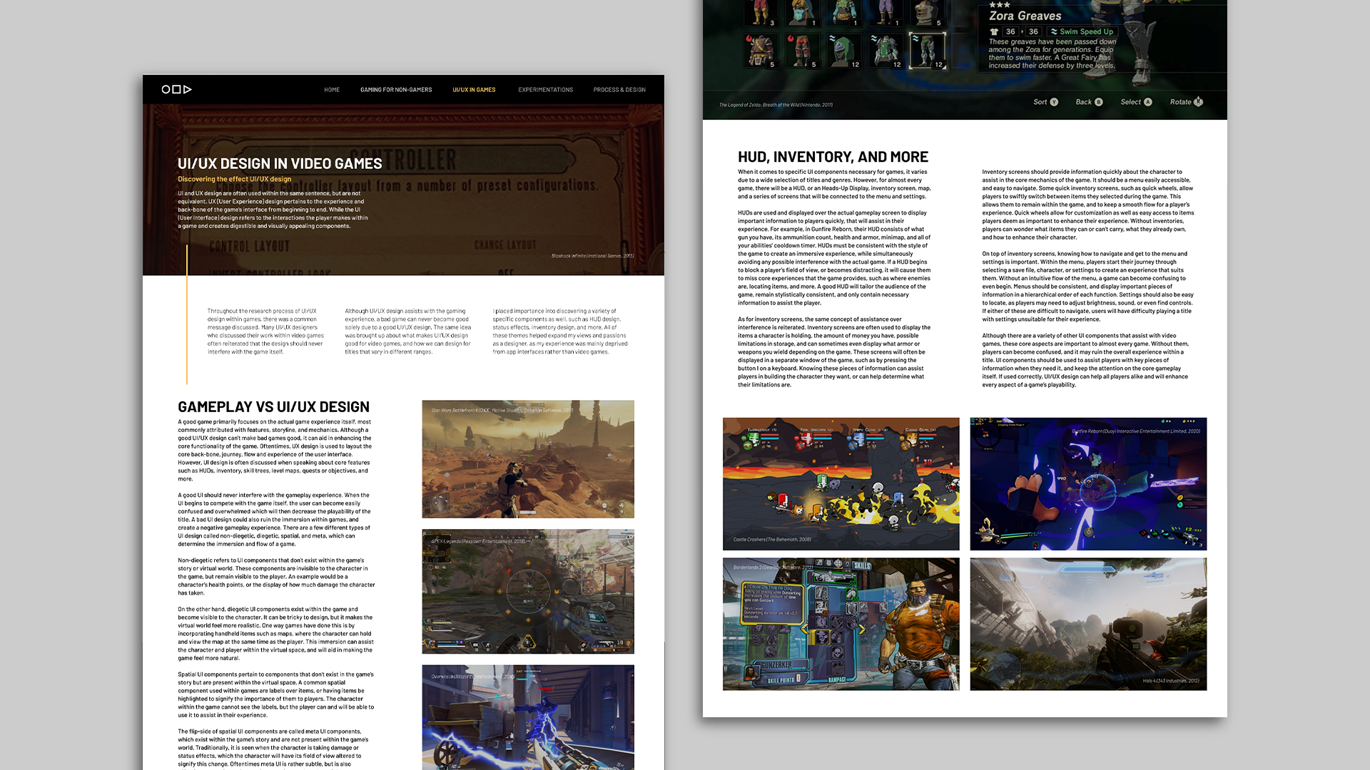
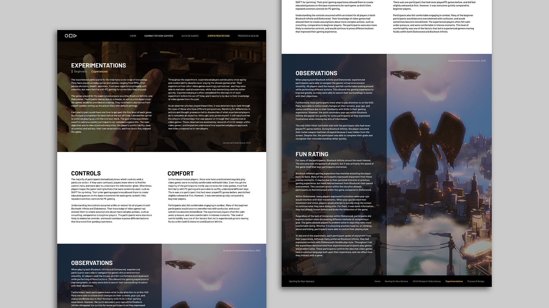
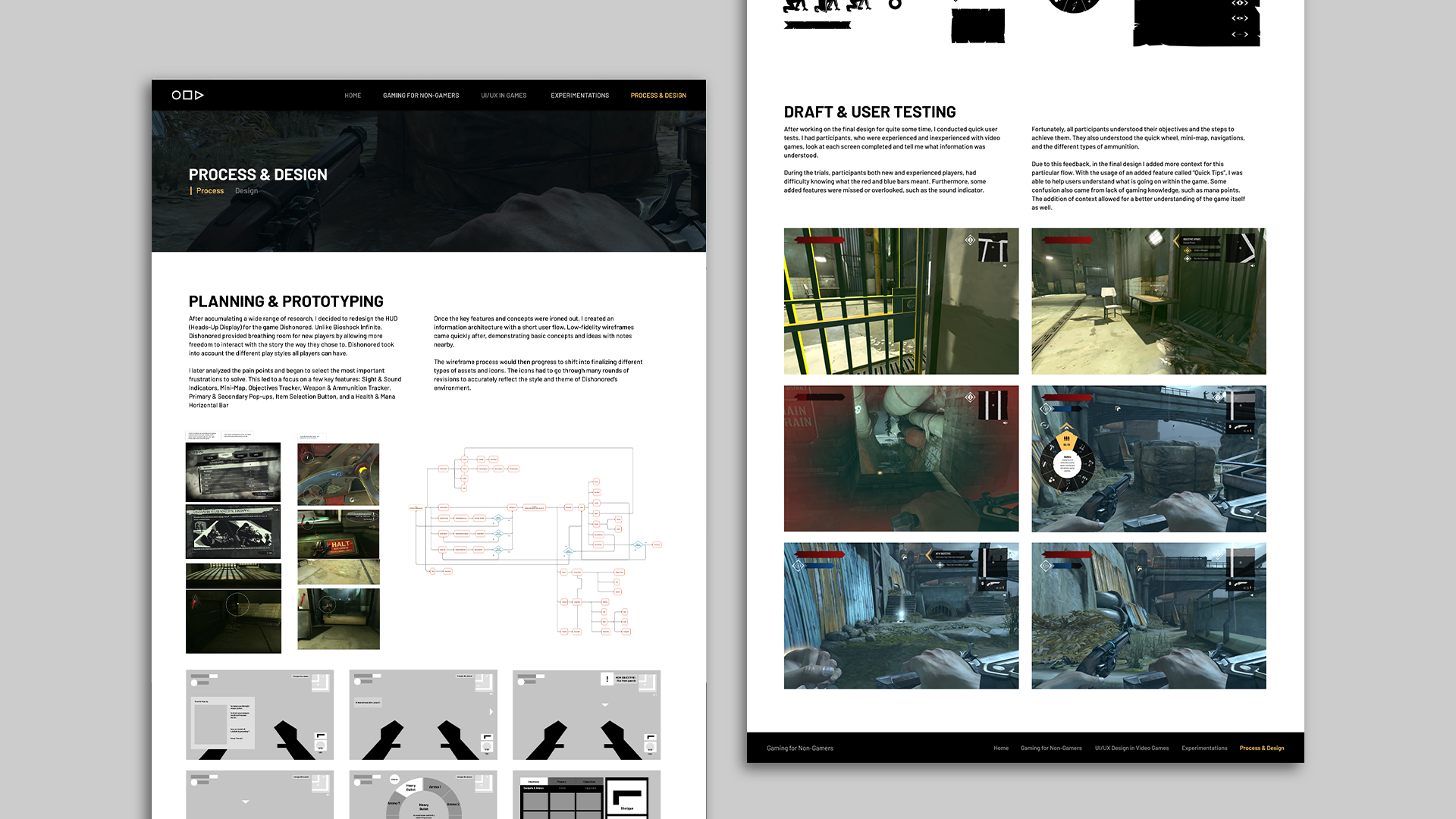
To showcase my findings on how players experience video games differently depending on their familiarity, I designed and coded a website to organize my research.


A Quick Dive
Research · Info Arch & Site Map · Wireframes & Fidelities · Design · Prototype · Coding & Development
LEARNING NEW THINGS
- The initial stage of organizing content was initiated by 2 months of heavy research into the following topics: UI / UX design within video games, different design components in video games (ie. skill trees, inventory screens, HUDs, etc.), game design, web design, and HTML & CSS.
- Once organized, I looked at competitors to see how they developed their navigations, home pages, news articles, blogs, push users to different topics, and more. This research didn’t just involve visual observation, but also developmental in terms of how they coded their HTML and CSS.
PICKING A PATH & STRUGGLING
- For navigation, I added a bar at the top and bottom of each page to allow visitors to jump from different topics in addition to a flow if they wanted to read about my research from start to finish.
- I knew I had to keep it simple due to my lower proficiency in web development, so I designed the website to have static pages. With this, I can focus on its functionality to maintain effective communication of my research story.
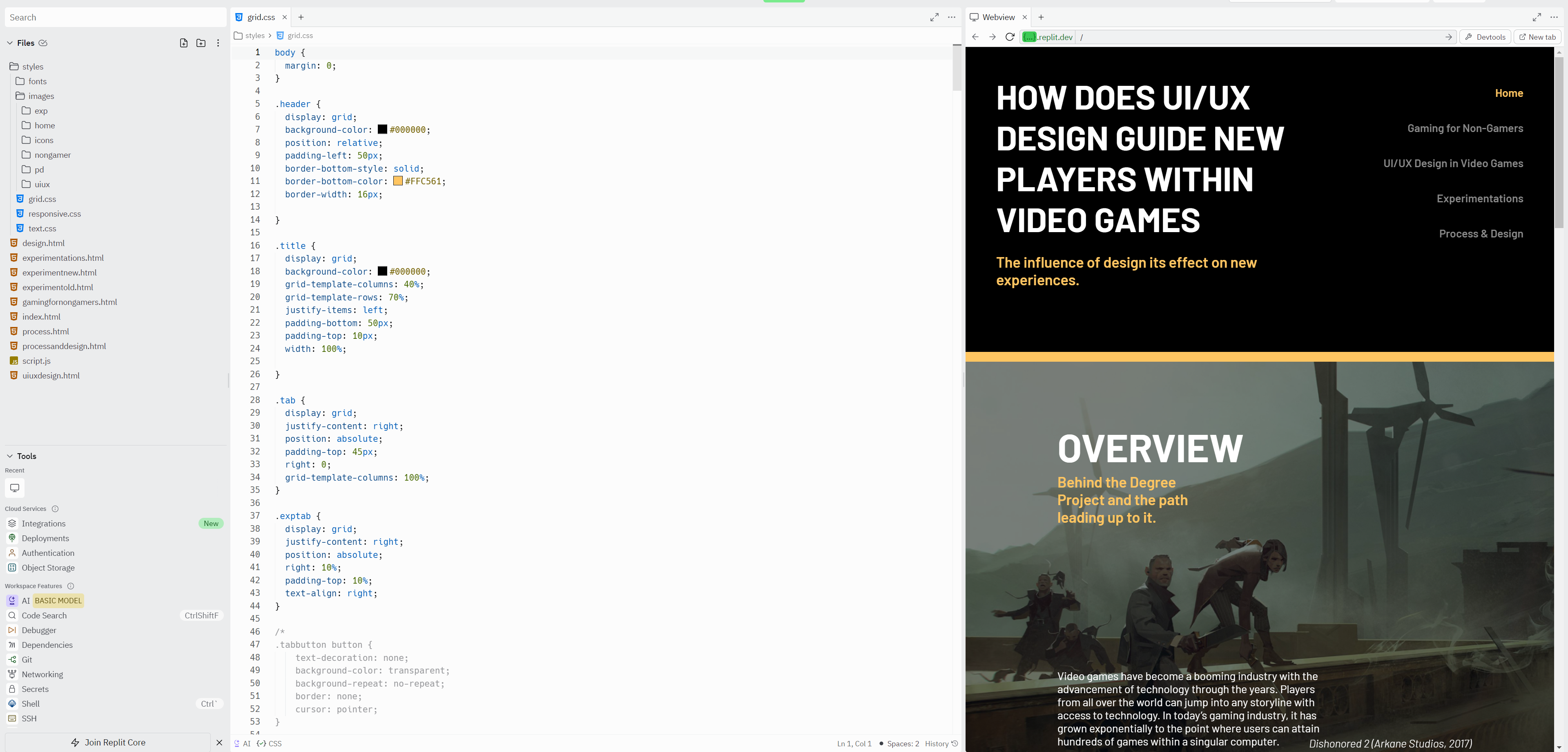
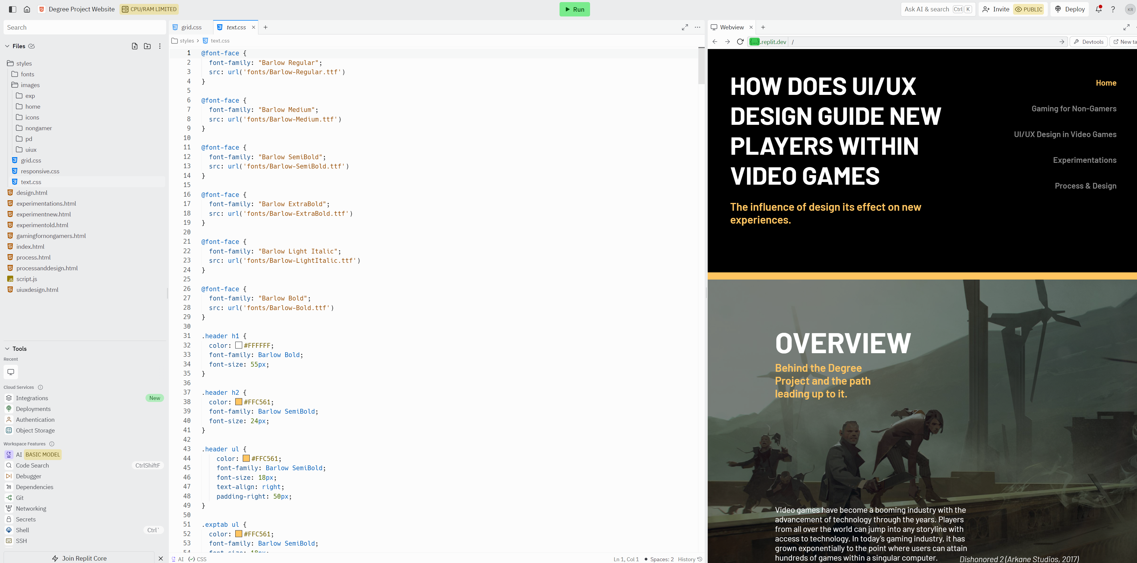
- Once the coding process began, I did (inevitably) run into issues. Because of how I had displayed each image and set the text, the website would break its layout depending on the browser’s screen size. The website was not responsive and as a temporary solution, I attempted to redesign the page for different display sizes on a separate CSS file. In this CSS file, I began to use percentages instead of pixels in hopes of solving this accessibility issue. Although it was successful in the interim, it did cause images to appear repetitive if your screen did not fit the conventional sizes I had coded for.