WIC Shopper
Personal · Product Design · Mobile App
Concept · Research · Design · Prototype
Figma · Illustrator · Photoshop · Premiere
RESULTS
Researched competitors, conducted interviews, created a new visual system, developed a mobile app prototype.
GOALS
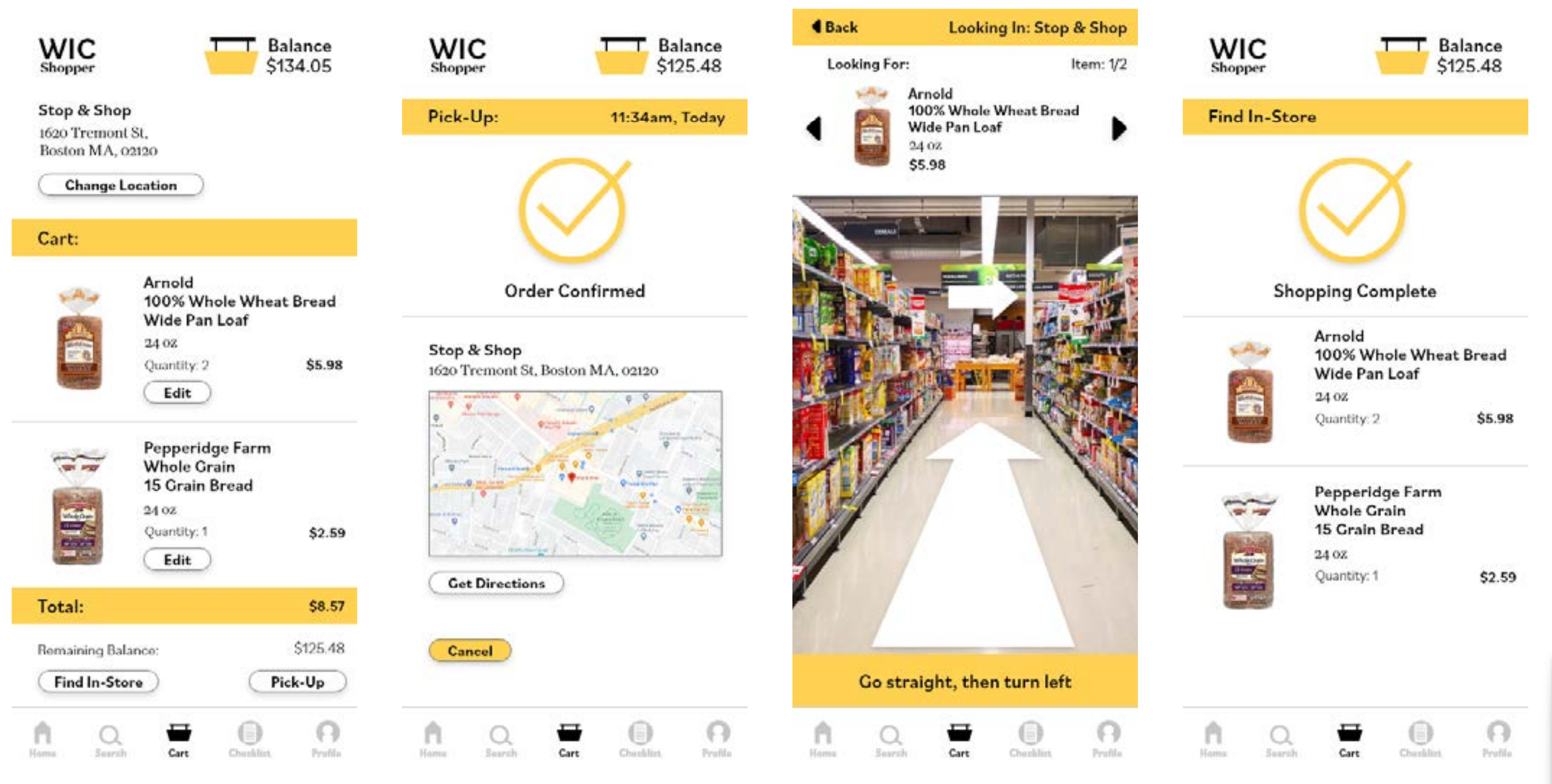
WIC is a program that provides women, infants, and children the ability to afford nutritious food. I redesigned the WIC app to help people in the WIC program plan and navigate their groceries.


A Quick Dive
Research · Info Arch & Site Map · Wireframes & Fidelities · Design · Prototype
THE REAL DEAL
Families who participated in the WIC program were asked a series of questions about their experience within the program, eligibility, frustrations, and their perspectives with using the WIC app.
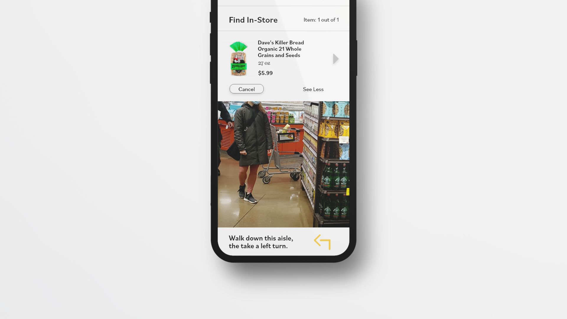
- Foster Mother: WIC helped with affordability for high calorie formula but had difficulties finding a grocery store that had the specific brand and size of formula in stock.
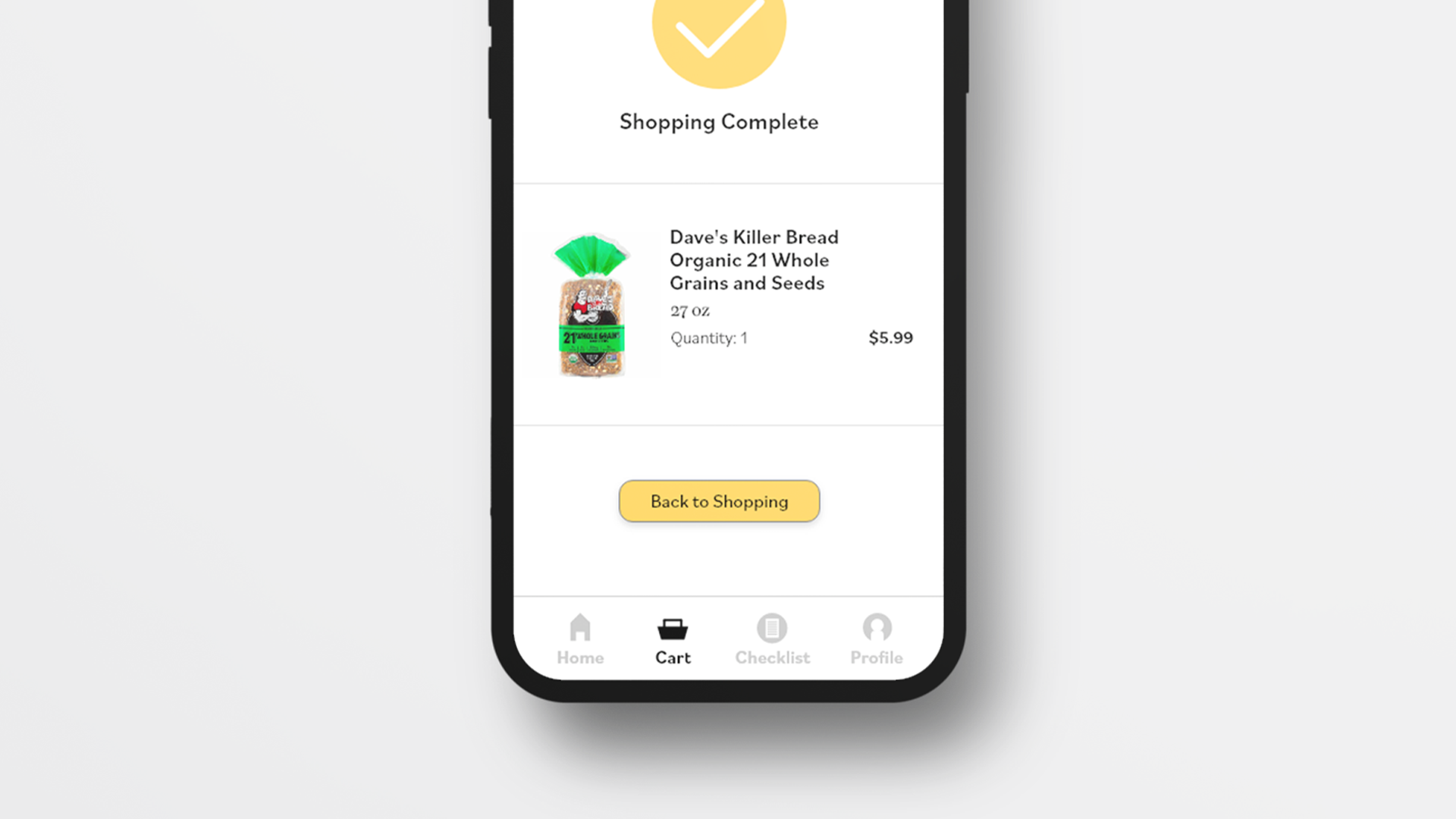
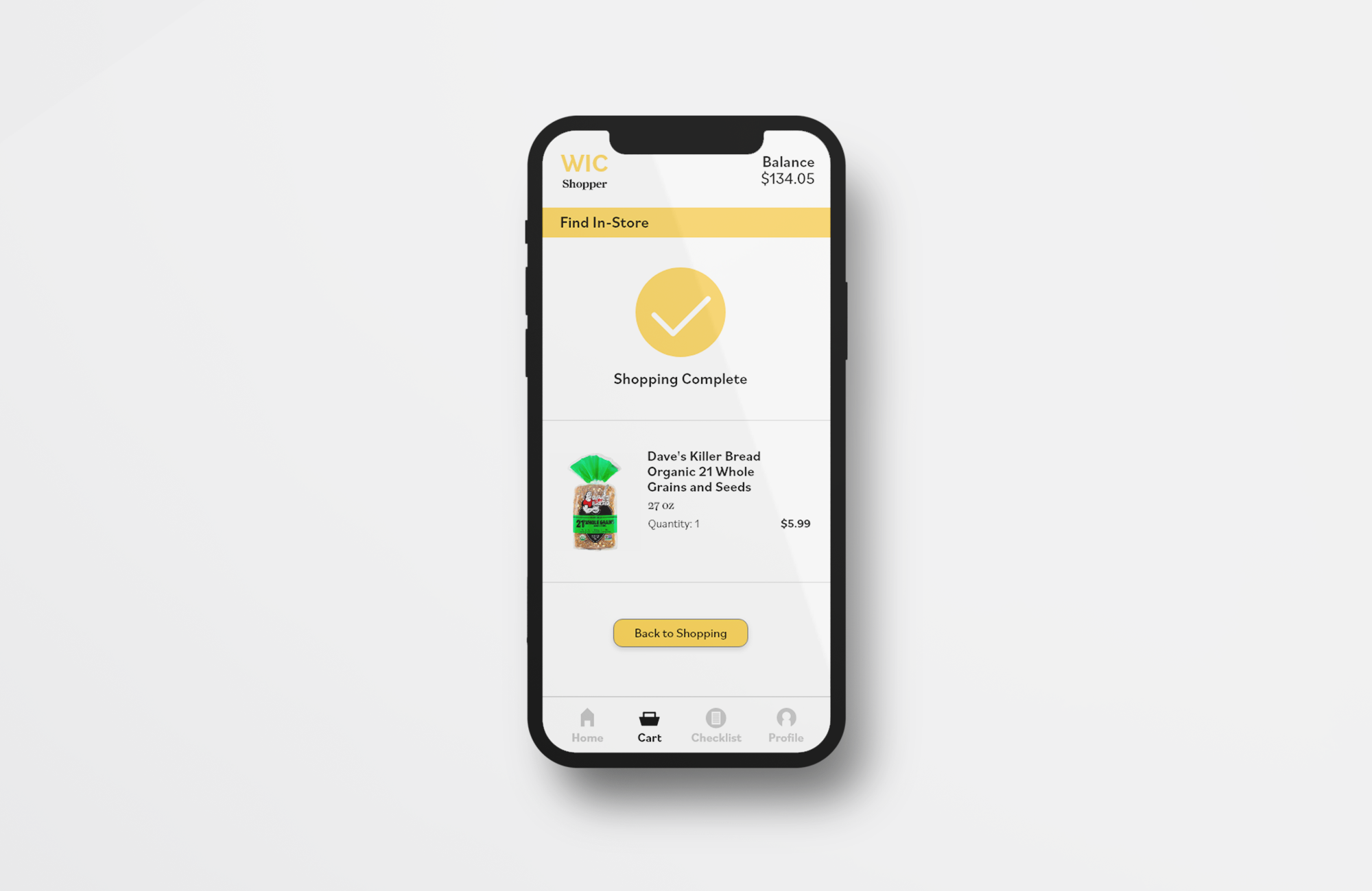
- Father of 3: Was conscious about nutrition and the app allowed him to find the right brand and size of a WIC eligible product. However, at checkout he would be denied by the cashier because the items he wanted to purchase, regardless of the WIC label on the shelf, weren’t eligible. After checkout, a receipt would be given with the remaining balance on the card but not within the app.
- Mother in Pregnancy: When using the app, she could see product photos but sometimes they don’t always appear. Products weren’t sorted in a way that made sense and would make her feel overwhelmed. Whenever she goes grocery shopping, she likes to use the app to create a shopping list and find eligible items.
- Mother with a Baby: The experience of WIC wasn’t very memorable. There weren’t any pain points that stuck out to her or barriers she could recall. During her time using WIC, she was able to ship grocery items to her doorstep which felt convenient and easy for her limited schedule.
GETTING THE BALL ROLLING
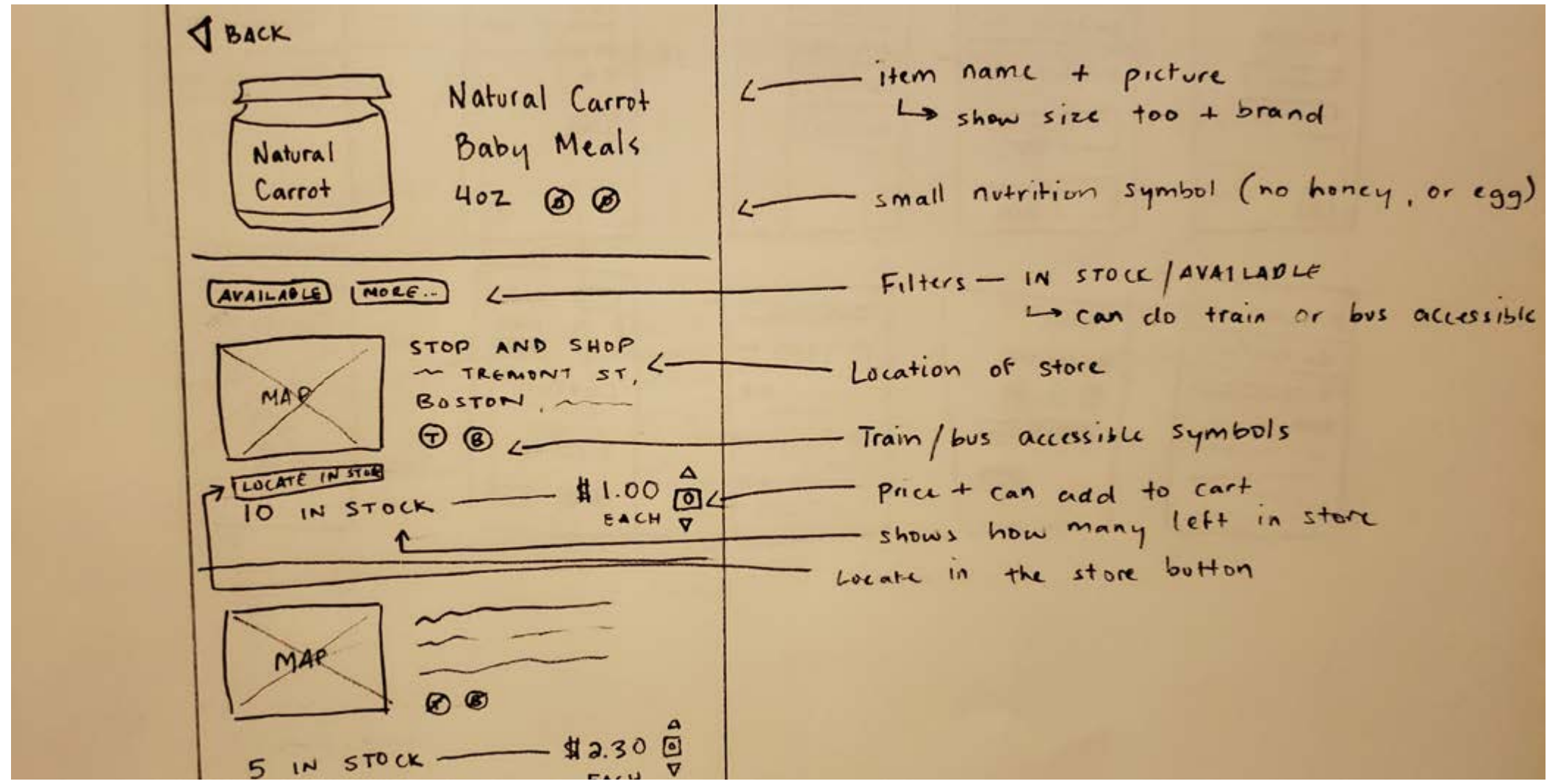
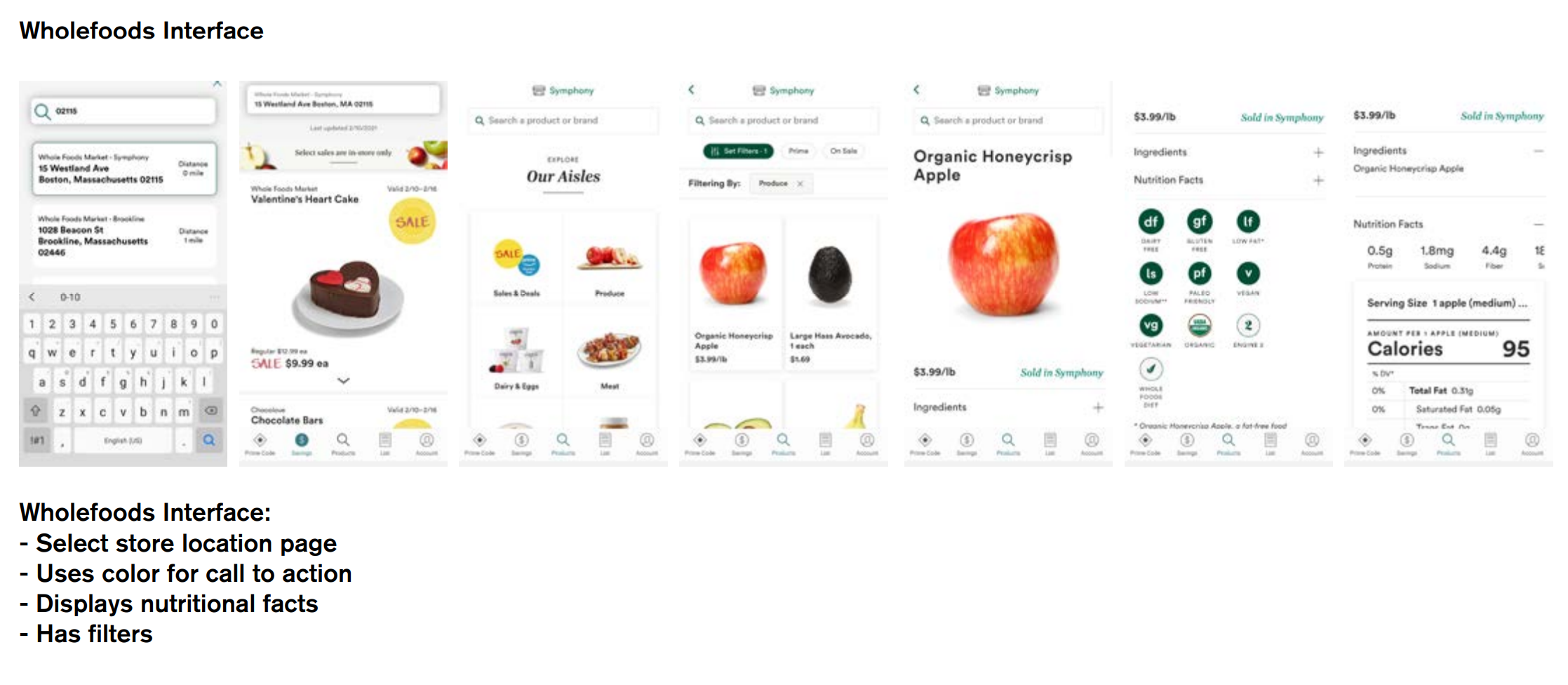
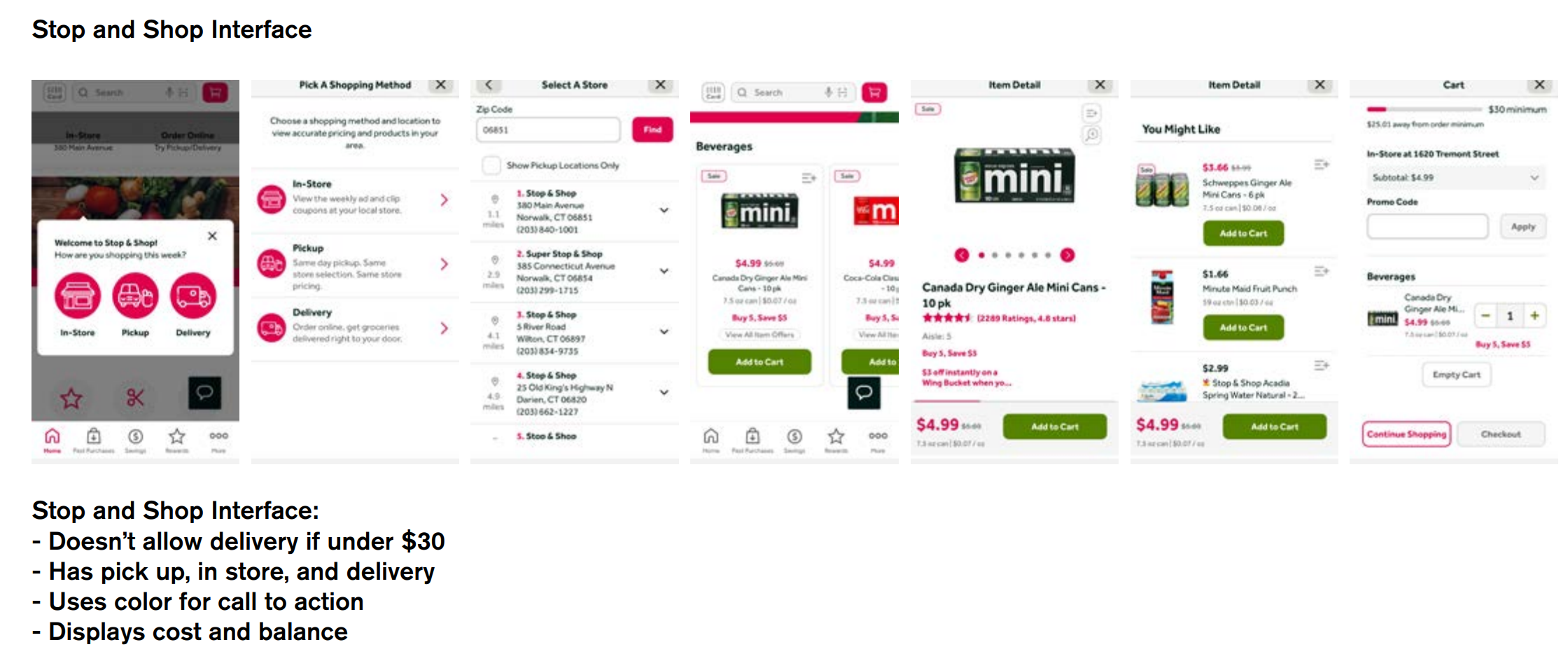
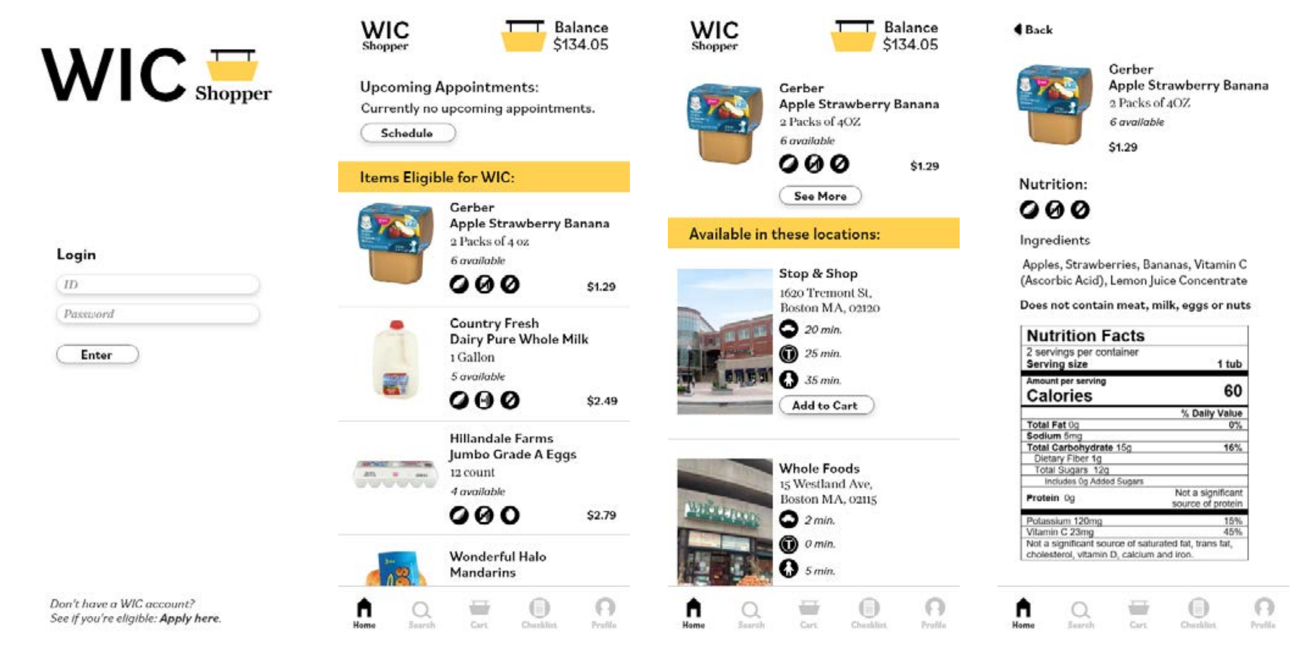
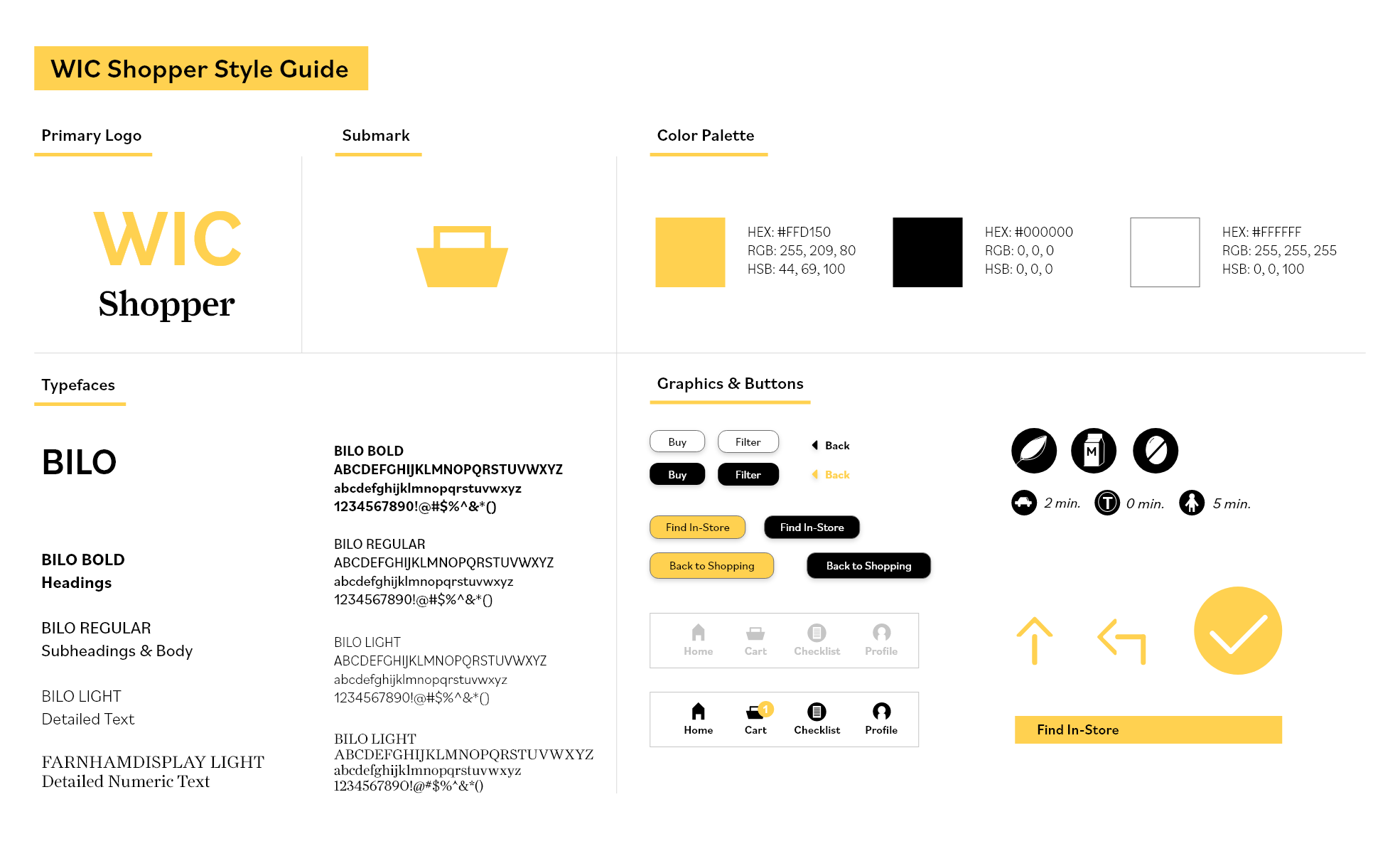
- When deciding what visual approach to take I compared the original app with my competitive research. I took inspiration from competitors like Stop & Shop and WholeFoods and observed how they navigate customers, display nutritional facts, and showcased food pick-up or delivery. In addition, I wanted the redesign to be visually consumable and maintained a simple approach to focus on functionality.
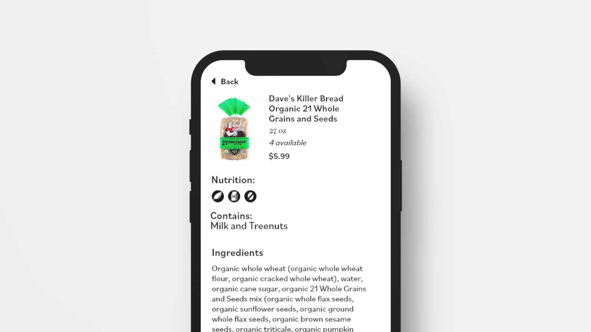
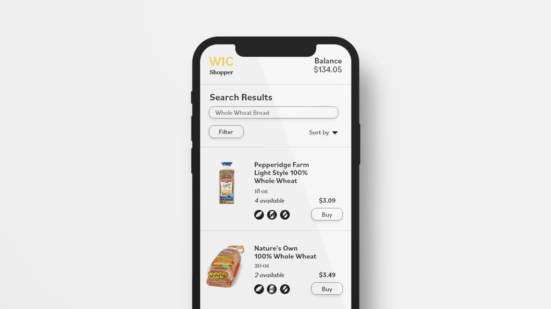
- When adding features, I looked at common complaints from the WIC interviews. Most of the participants had difficulties finding items or ensuring that the item was eligible and fits within their budget. Adding features like a balance information, dietary filters, different store locations, and using AR to locate products in real-time were concepts I had to minimize frustration points that participants had expressed with the original app.